品牌设计风格,
收藏于此,一览无余。
来自全球顶尖品牌的 69 套设计系统——配色、字体、间距与版式语言——提炼为风格指南、实时预览与设计令牌。
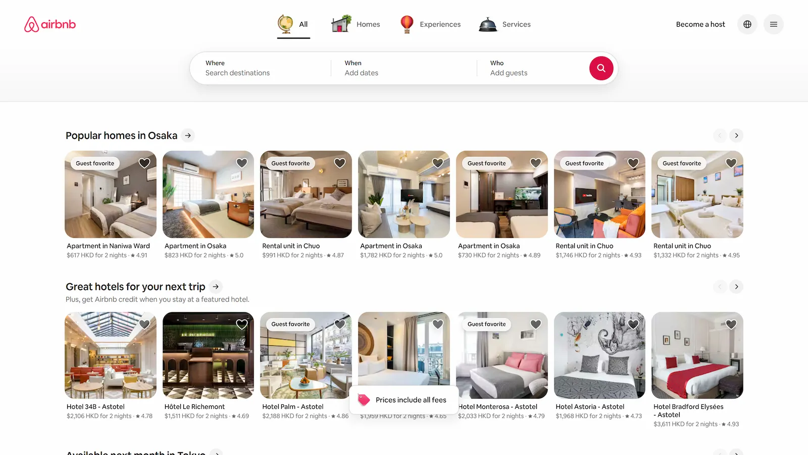
Airbnb
旅行与出行Airbnb pairs a clean white canvas with its signature Rausch pink, friendly rounded forms, generous spacing, and photography-led cards to create a warm, approachable marketplace for homes, experiences, and services.
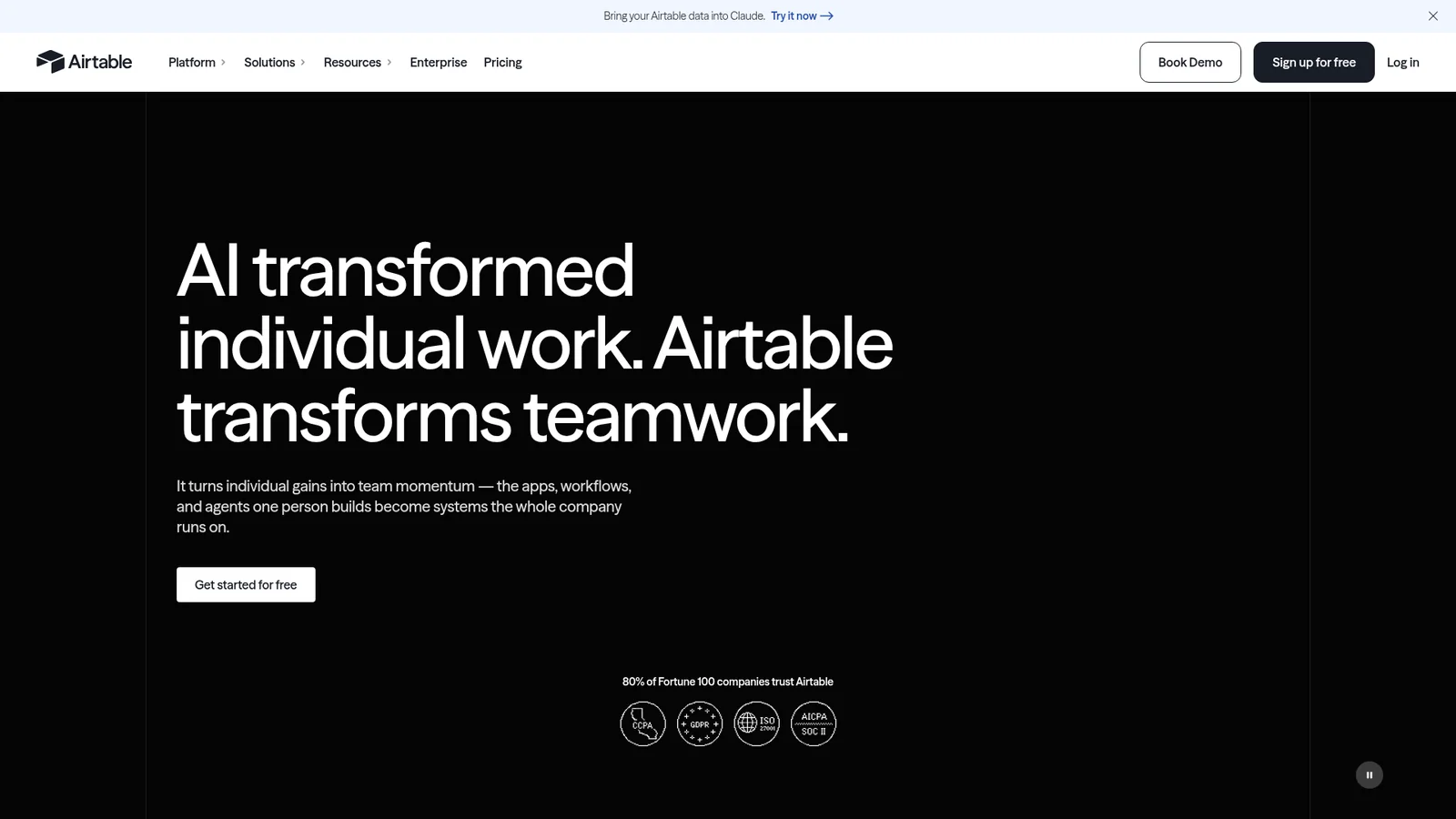
Airtable
生产力与 SaaSA sober, editorial workflow-software interface anchored on white canvas and dark-ink type, where brand voltage comes from full-bleed signature cards in coral, dark green, peach, and dark navy that punctuate long-scroll explainer pages. Primary actions use a near-black pill CTA; secondary actions sit in a white outlined button. Type runs Haas Grotesk in modest weights — never bold for its own sake.
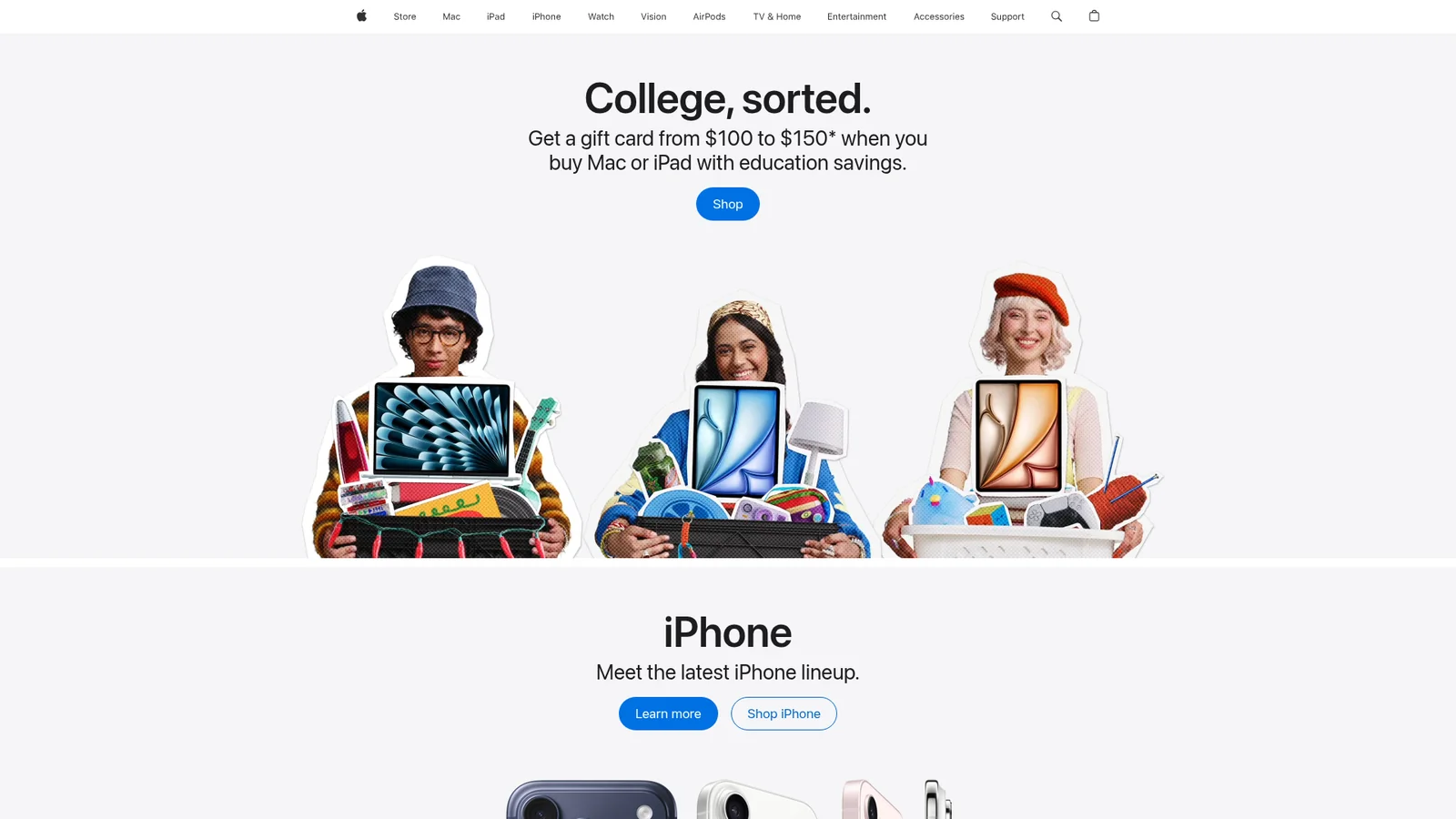
Apple
媒体与消费科技A photography-first interface that turns marketing into a museum gallery. Edge-to-edge product tiles alternate light and dark canvases, framed by SF Pro Display headlines with negative letter-spacing and a single Action Blue (#0066cc) interactive color. UI chrome recedes so the product can speak — no decorative gradients, no shadows on chrome, only the one signature drop-shadow under product imagery resting on a surface.
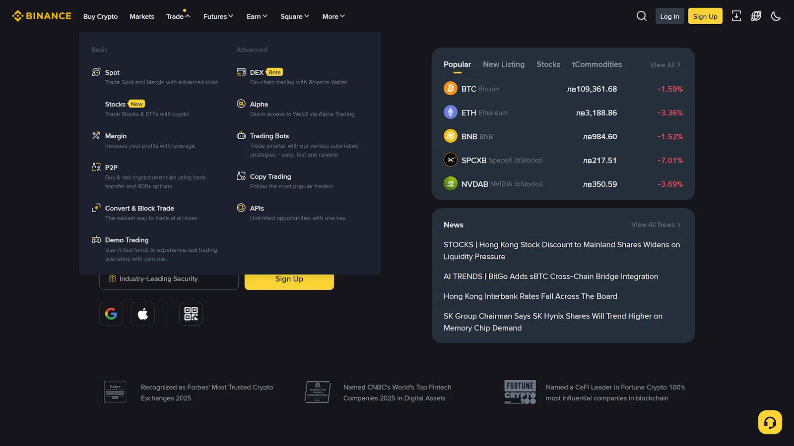
Binance
金融科技与加密A confident financial-platform interface anchored on a deep near-black canvas, where Binance's iconic yellow (#FCD535) carries every primary CTA, brand accent, and value-claim moment. Type runs Binance's custom BinanceNova / BinancePlex stack at modest weights — the system trusts size and yellow voltage over bold weight. Marketing and product surfaces default to the dark theme; transactional surfaces (buy crypto, deposit, exchange) flip to a light theme that shares the same yellow CTAs and gray-blue hairlines. Trading green (up) and red (down) accents thread through both modes for price-direction signals.
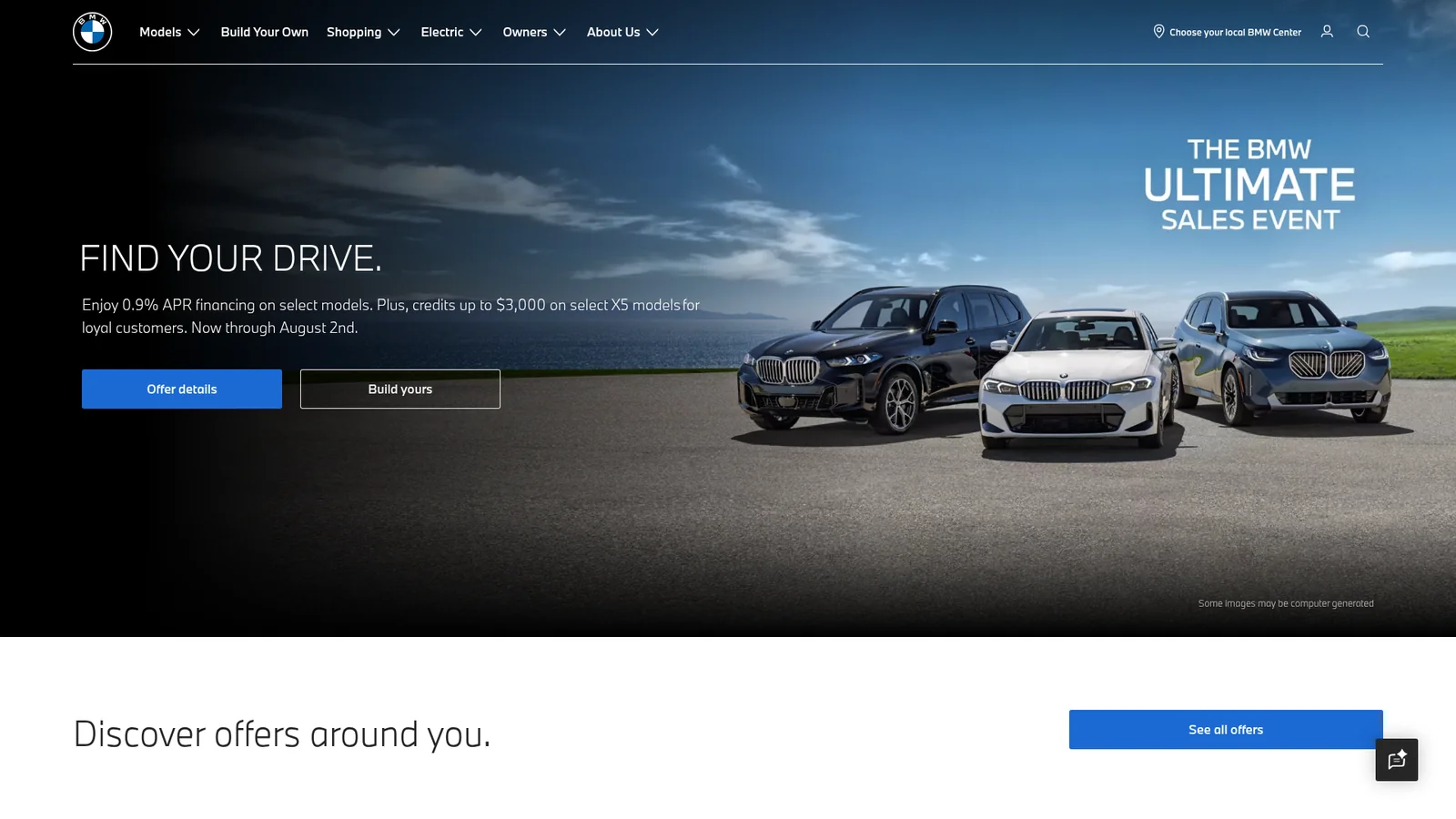

BMW
汽车BMW's corporate site — distinct from BMW M's motorsport-bombastic variant, this is a measured and settled corporate-automotive interface. On a light (cream-tinted white) canvas, BMW corporate blue (#1c69d4) carries every primary CTA; dark navy hero bands frame model photography. BMW Type Next Latin sets the entire hierarchy on two weights — heavy 700 display and Light 300 body. Configuration and reservation flows ride a card-based 4-up grid, where each card holds a model render, a name, and a "Learn More" link.
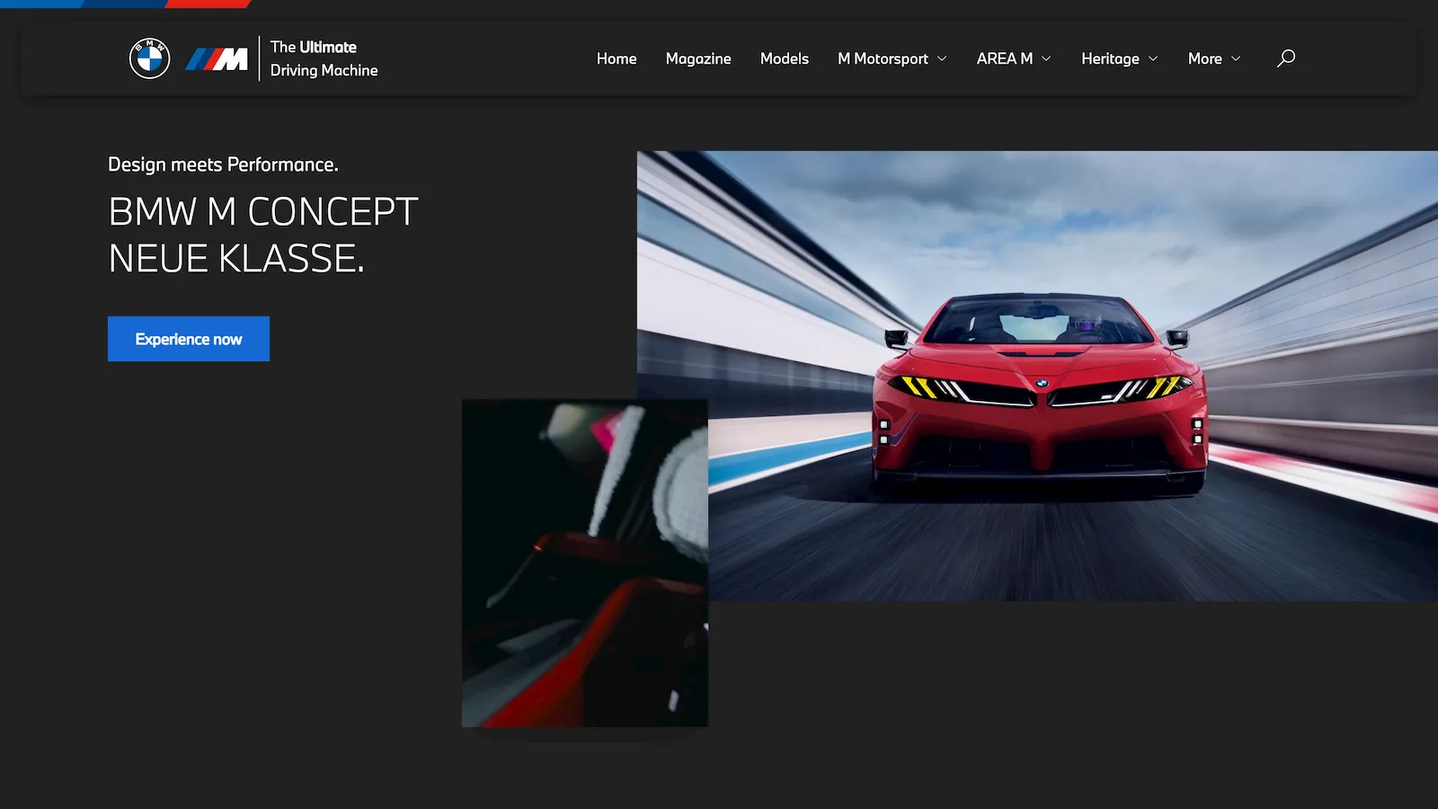

BMW-M
汽车A motorsport-engineering interface anchored on a near-black canvas with white BMW Type Next Latin display headlines in confident UPPERCASE. The brand carries no decorative voltage — its energy comes from full-bleed automotive photography (cars on tracks, driver-cockpit shots, carbon-fiber detail) and the iconic M tricolor stripe (light blue → dark blue → red) used sparingly as a brand signature on logos, dividers, and motorsport chrome. Type stays light to medium weight to feel European-engineered, never American-bombastic.
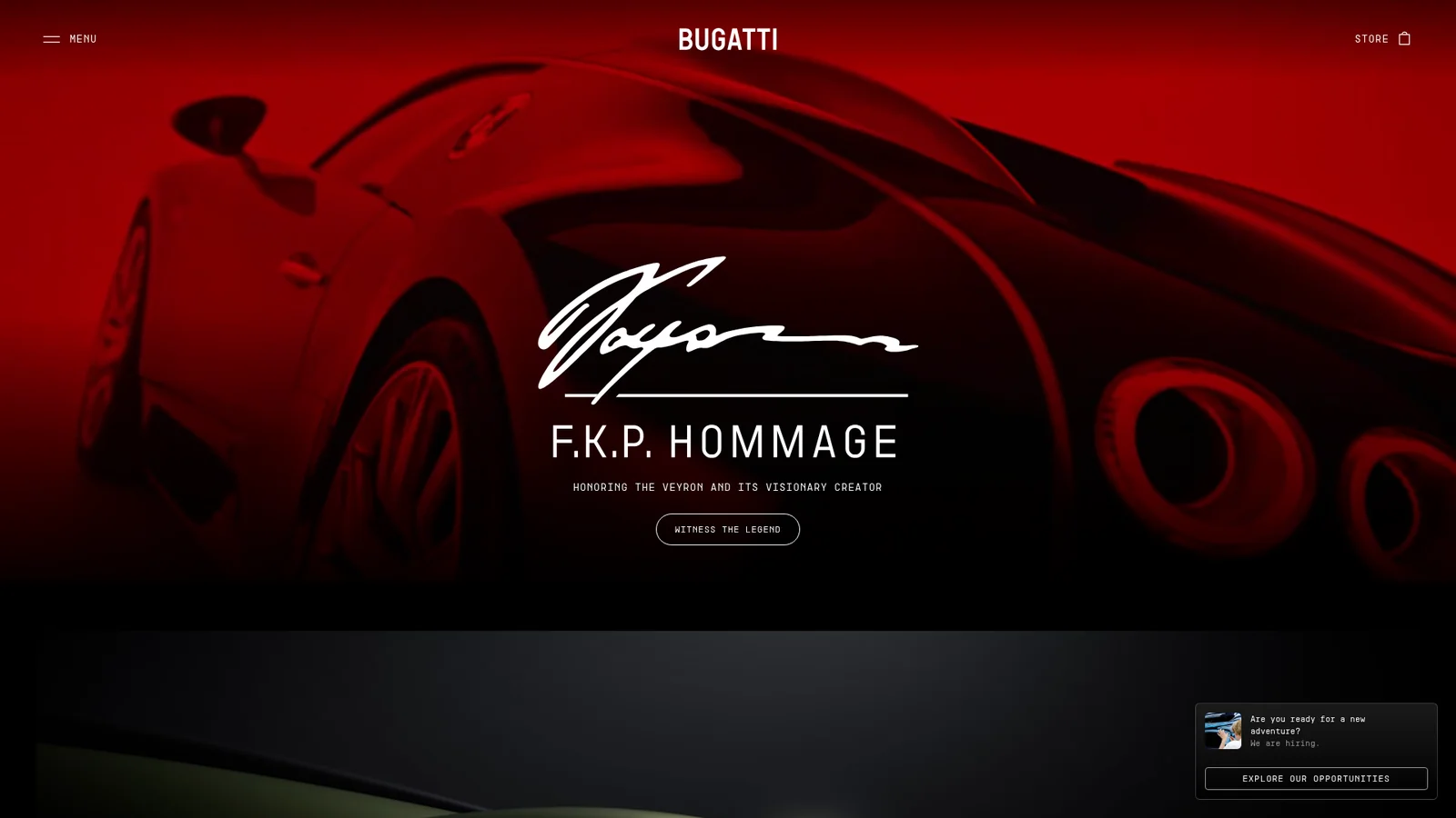

Bugatti
汽车An austere luxury-automotive interface that uses near-pure black canvas, white uppercase letterspaced display, and full-bleed automotive photography as the only voltage. The system runs three custom Bugatti typefaces — Bugatti Display, Bugatti Text Regular, and Bugatti Monospace — and combines them at modest weights with wide tracking to feel European-engineered, hyper-minimal, and quietly expensive. There is no accent color, no decorative element, no chrome — only photography, typography, and the brand wordmark.
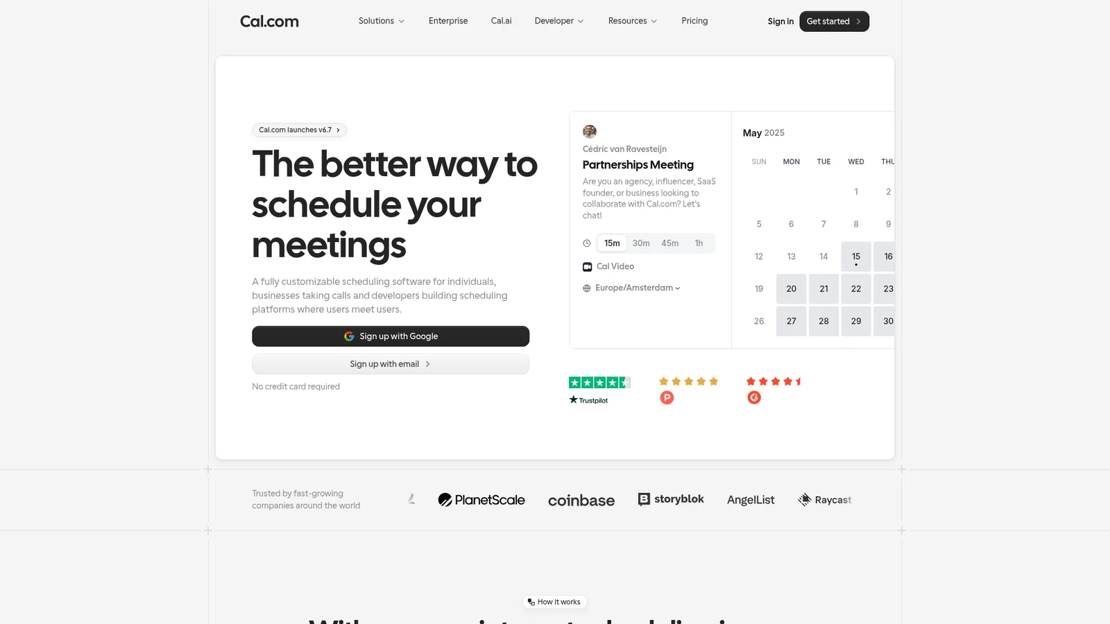
Cal.com
生产力与 SaaSA clean, calendar-software-first interface anchored on white canvas with black primary CTAs and custom Cal Sans display typography. The system reads as friendly modern SaaS — generous whitespace, soft-rounded cards (~12px), product UI fragments shown directly inside cards, and a dark navy footer that visually closes long-scroll pages. Brand voltage comes from the Cal Sans display headline (a custom geometric face) and from product UI artifacts shown in-card rather than from accent colors.

Caldera
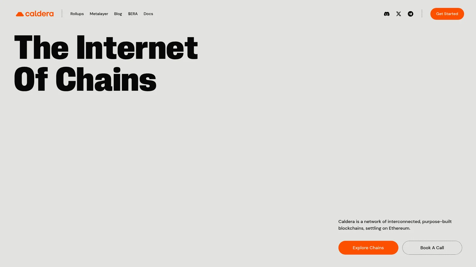
游戏与娱乐Caldera uses warm limestone, molten orange, oversized condensed type, halftone textures, and soft rounded forms to create a bold volcanic visual identity.

Claude
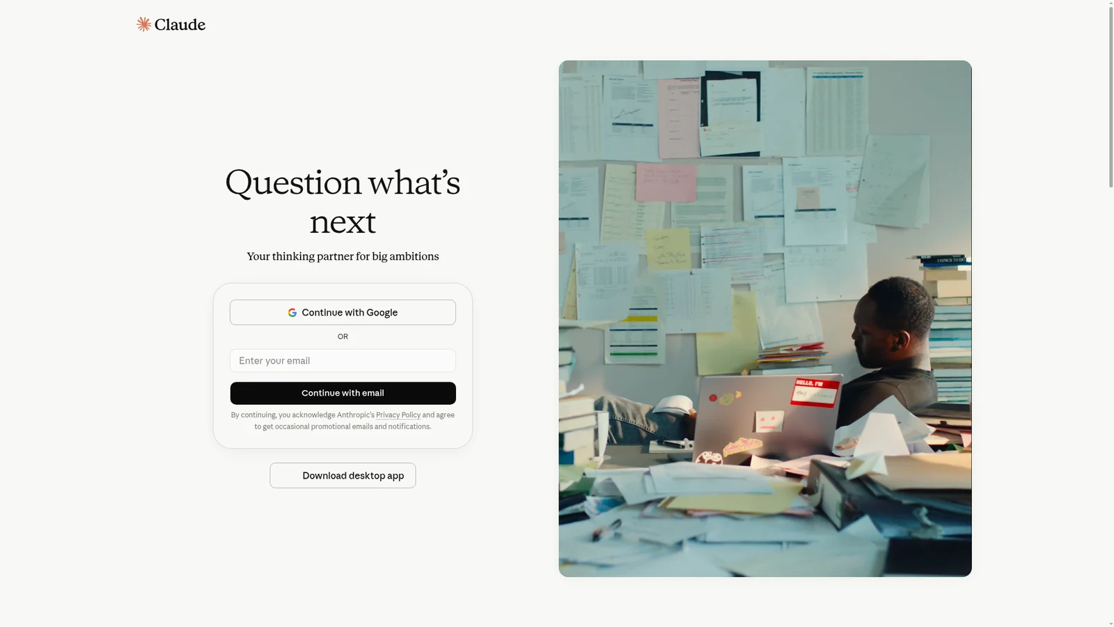
AI 与大模型平台A warm-canvas editorial interface for Anthropic's Claude product. The system anchors on a tinted cream canvas with serif display headlines, warm coral CTAs, and dark navy product surfaces (code editor mockups, model showcase cards). Brand voltage comes from the cream/coral pairing — deliberately warm and humanist where most AI brands use cool blue + slate. Type voice runs a slab-serif display ("Copernicus" / Tiempos Headline) for h1/h2 and a humanist sans for body. The signature Anthropic black-radial-spike mark anchors the wordmark.

Clay
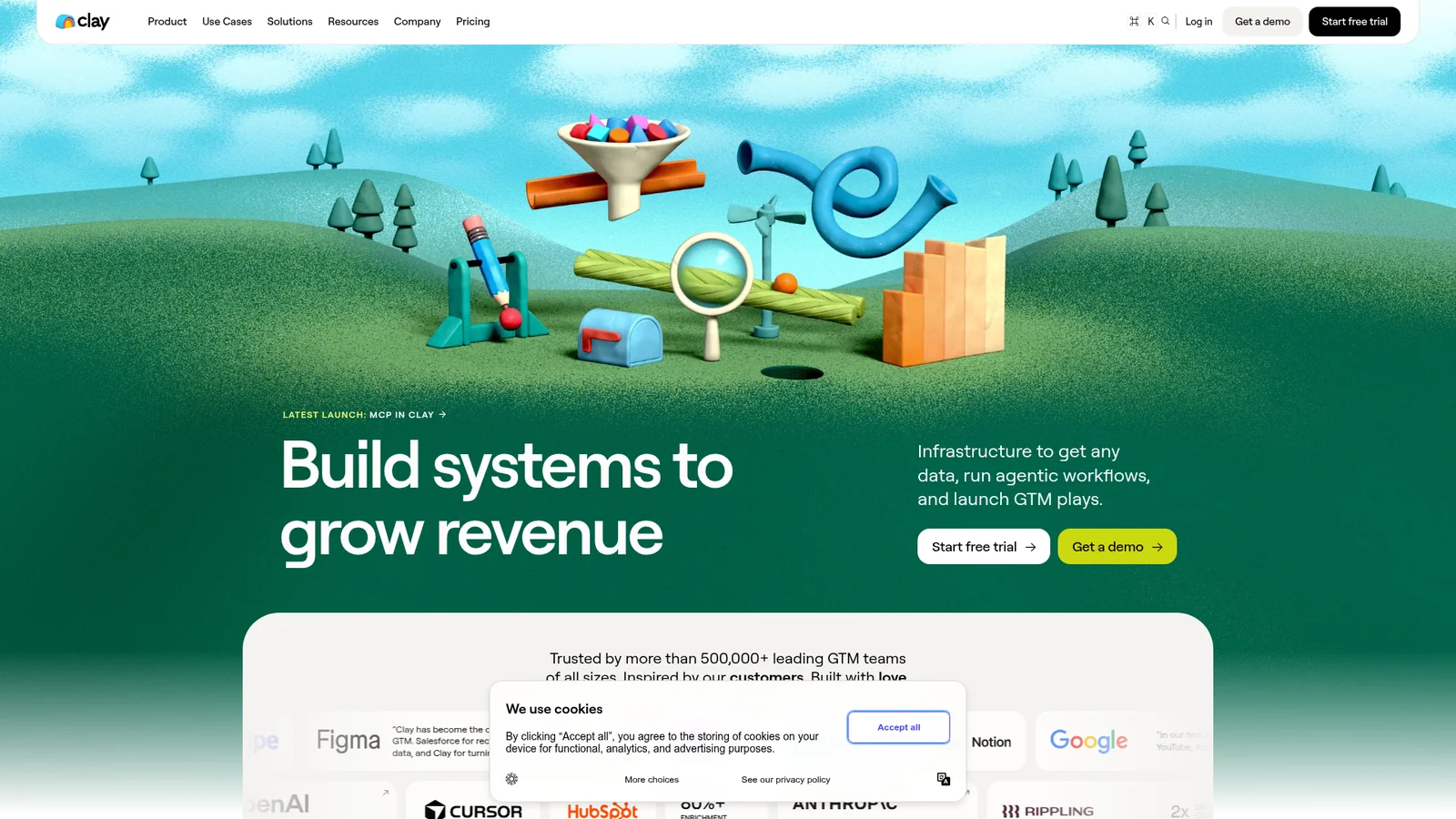
生产力与 SaaSA vibrant claymation-meets-data interface for Clay.com (GTM data-orchestration platform). Anchors on white canvas with dark-navy primary CTAs, custom rounded display type, and saturated single-color feature cards — hot pink, deep teal, lavender, peach, ochre — that punctuate long-scroll explainer pages. Brand voltage comes from 3D-rendered claymation illustrations (mountains, characters, mascots) used as full-bleed hero artifacts and the bright multi-color card surfaces showing product UI fragments.
ClickHouse
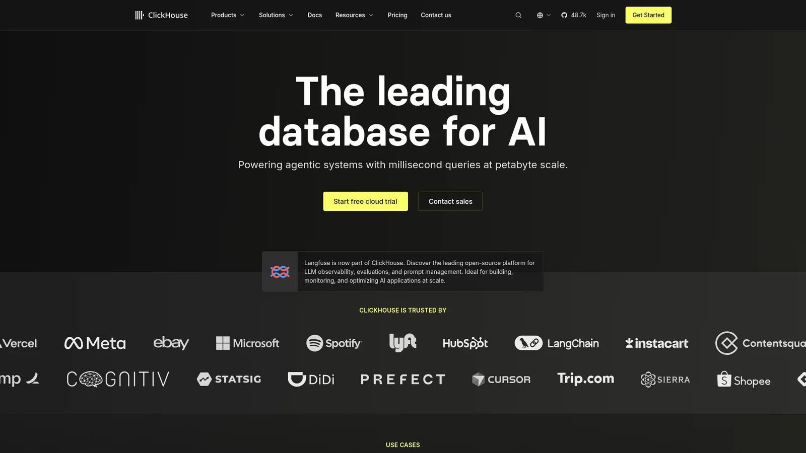
后端、数据库与 DevOpsA high-performance database interface anchored on near-pure black canvas with electric yellow as the brand voltage. White typography in confident sans, yellow CTAs, and yellow-text stat numbers carry the brand voice across every page. Code blocks and product UI fragments embed directly in dark cards. The yellow + black pairing (and yellow used scarcely as accent) is the system's signature — brand identity without atmospheric decoration.

Cohere
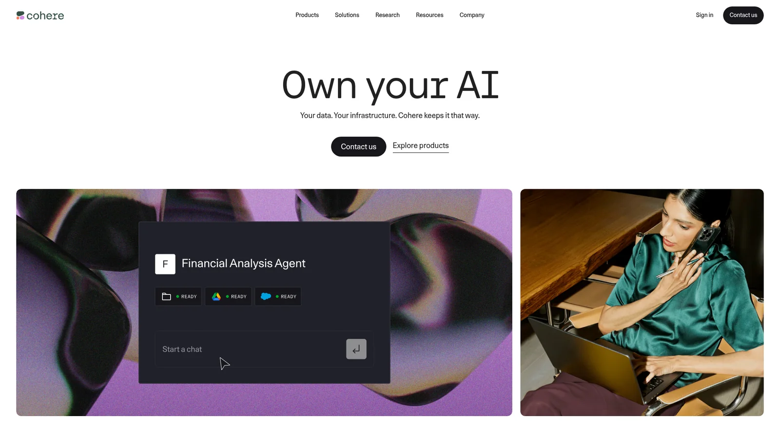
AI 与大模型平台Cohere's 2026 web system is a controlled enterprise AI interface built from stark white editorial space, deep green-black product bands, soft mineral surfaces, rounded media cards, and a distinctive type split between monospaced-feeling display headlines and precise Unica77 UI text.
Composio
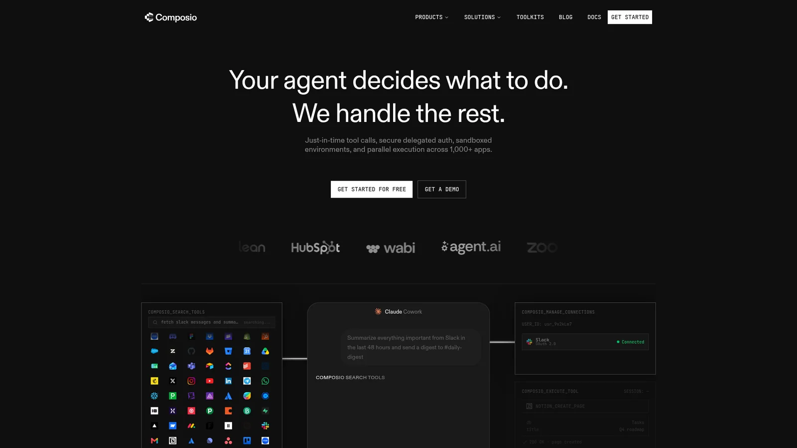
开发者工具与 IDEA developer-tools brand for AI-agent tool integration whose marketing surfaces lean into a dark, technical aesthetic with a single deep-electric-blue voltage (`#0007cd`). The page floor is near-black (`#0f0f0f`); cards float above on subtle gray-tinted surfaces. abcDiatype carries display and body in a single sans family with weights 400-600. The brand's strongest visual signature is a four-pane terminal-style mockup (a 2×2 grid of dark code/output panels) with a central blue spotlight glow — used as the homepage hero anchor.
Cursor
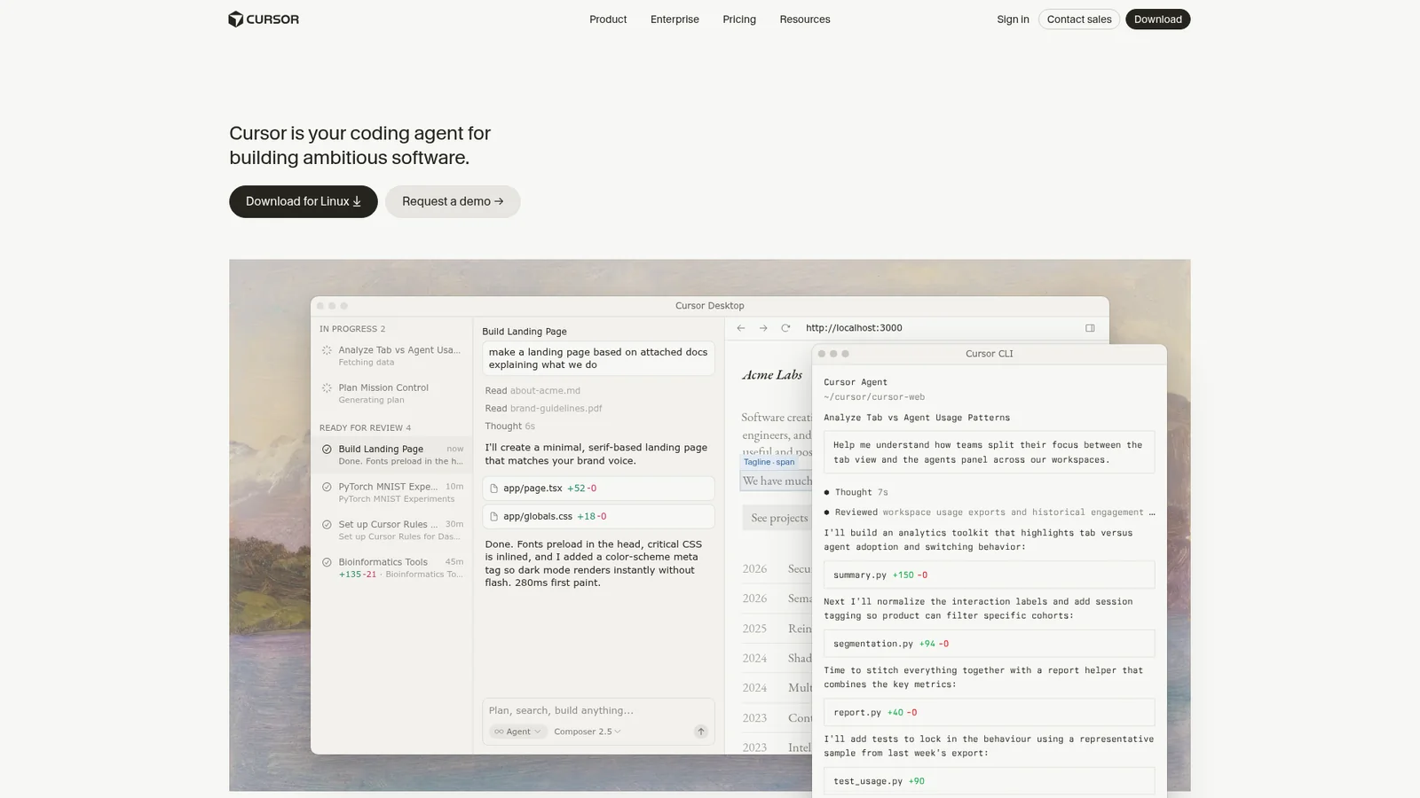
开发者工具与 IDEAn AI-first code editor whose marketing site reads like a quietly-confident developer-tools brand with a warm-cream editorial canvas (`#f7f7f4`) instead of the typical dark IDE atmosphere. Near-black warm ink (`#26251e`) carries body and display alike — display sits at weight 400 with negative letter-spacing for a magazine feel rather than a bold tech voice. The single brand voltage is **Cursor Orange** (`#f54e00`) reserved for primary CTAs and the wordmark. A signature pastel timeline palette (peach, mint, blue, lavender, gold) marks AI-action stages (Thinking / Reading / Editing / Grepping / Done) — only inside in-product timeline visualizations. Cards use minimal hairlines, no shadows, generous 80px section rhythm. CursorGothic for display/body, JetBrains Mono on every code surface (which is roughly half the page).
Duolingo
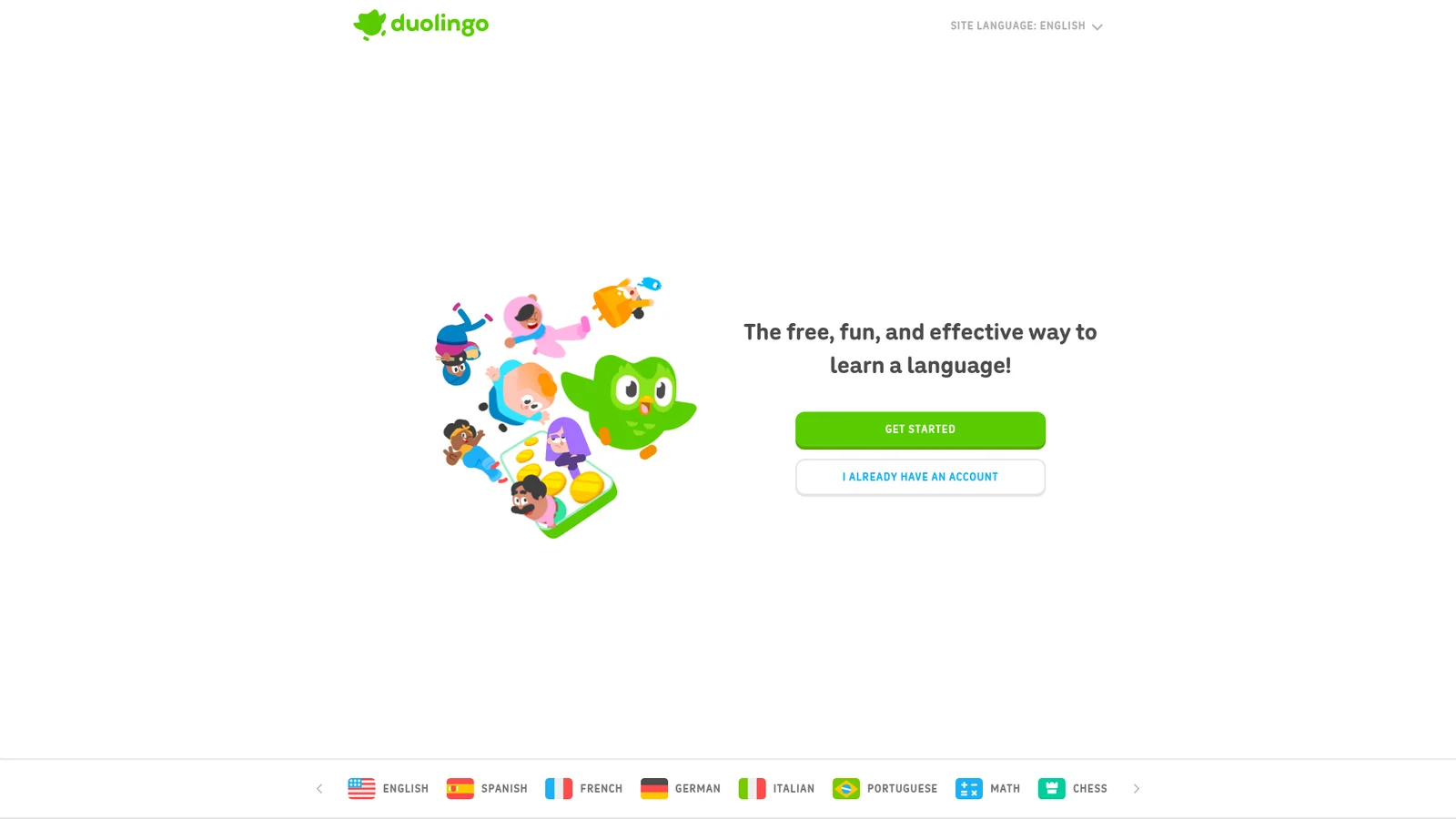
教育与学习Duolingo's interface treats the page like a children's storybook: white paper canvas, chubby rounded display type, and a single saturated green that reads as 'correct answer' the moment it appears. Body copy stays calm in mid-gray so the green and its accent blue can do all the emotional work — green for progress and headings, blue for interactive links and secondary actions. Components are pill-shaped or chunky-rounded with thick 2px borders in black or color, giving every button the feel of a sticker pressed onto the page rather than a flat UI control.
ElevenLabs
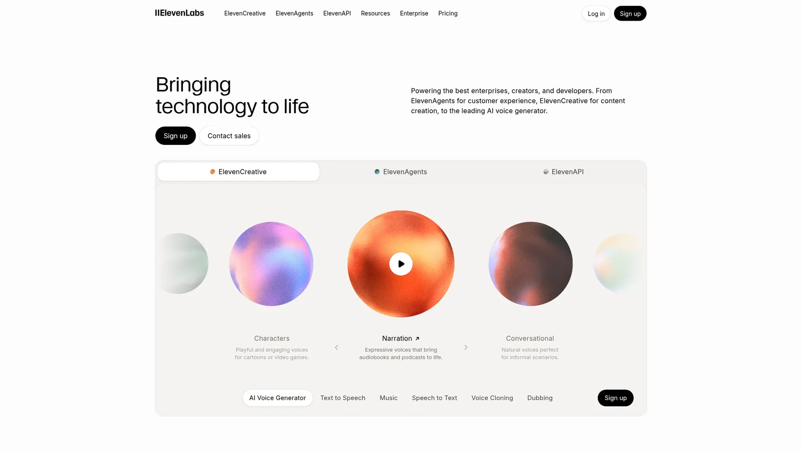
AI 与大模型平台A voice-AI brand whose marketing surfaces read like a quietly editorial print magazine. The base canvas is off-white (`#f5f5f5`) holding warm near-black ink (`#292524`); the brand voltage is photographic, not chromatic — soft pastel atmospheric gradient orbs (mint → peach → lavender → sky) drift through the page as the only "color" moments. Display runs Waldenburg Light at weight 300 — the editorial signature. Inter carries body, navigation, captions. CTAs are subtle: a near-black ink pill is the primary, a transparent outline is the secondary. The brand trusts atmospheric photography and modest type weights to do all of the brand work; there is no neon accent, no saturated CTA color, no developer-tools dark canvas.

Expo
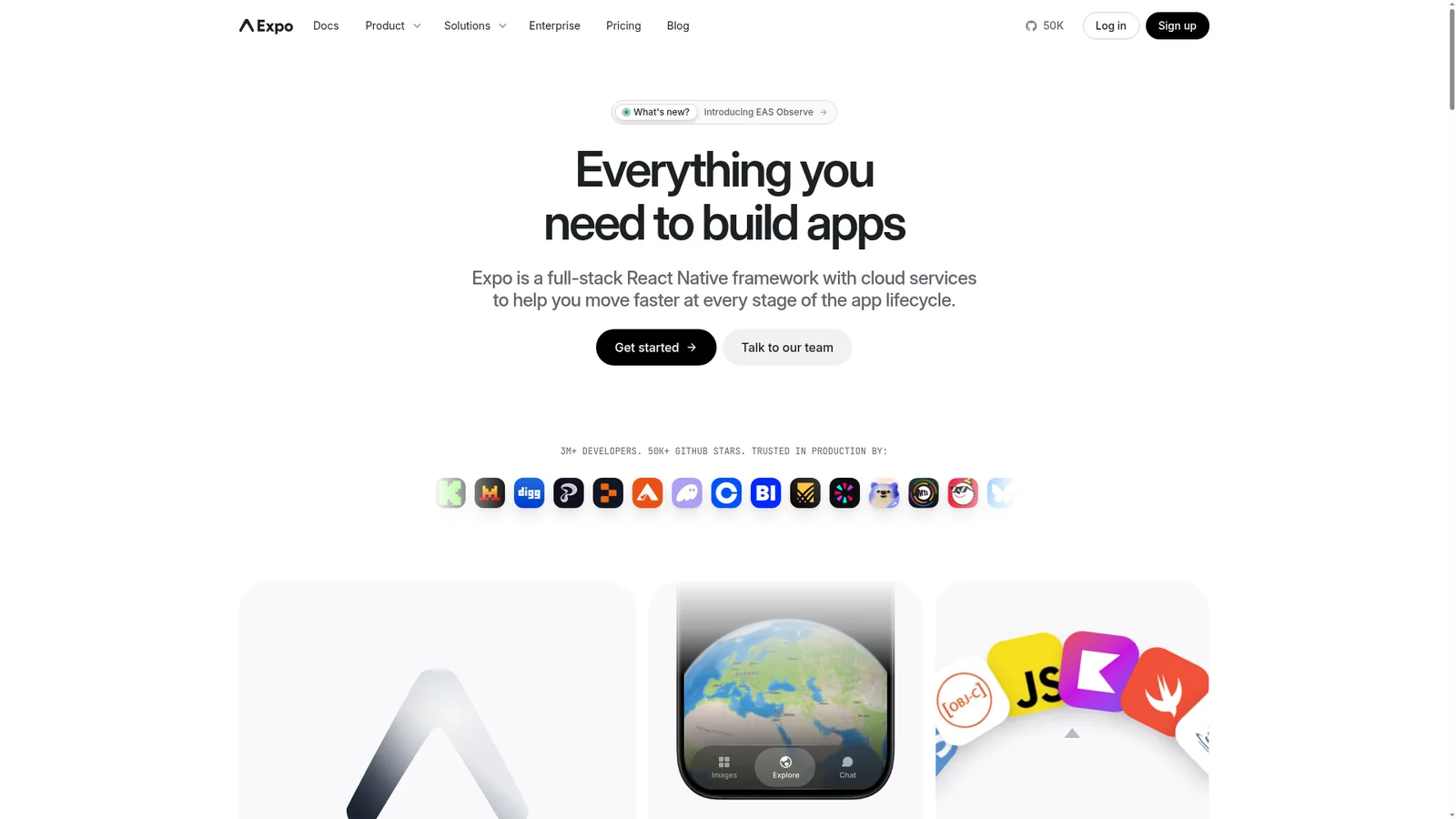
开发者工具与 IDEA React Native developer-platform whose marketing site reads like a quietly-confident infrastructure brand. The base canvas is pure white with a soft sky-blue gradient atmospheric wash behind the hero; near-black ink (`#171717`) carries body and display alike. The single brand voltage is **pure black** (`#000000`) for primary CTAs — minimal and editorial-feeling, paired with a small blue text-link accent (`#0d74ce`) reserved for inline body links. Type pairs Inter at modest weights (display 600, body 400) with JetBrains Mono on every code surface. The brand's strongest visual signature is the **device-mockup hero** — a centered MacBook + iPhone composite showing real Expo dev surfaces — over the gradient sky wash.
Figma
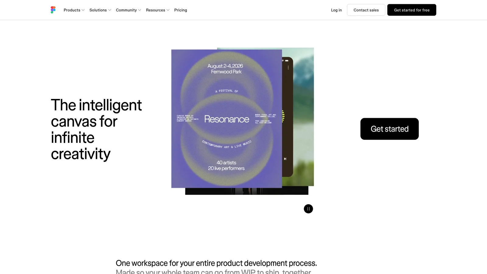
设计与创意工具A confident black-and-white editorial frame interrupted by oversized, hand-cut pastel color blocks. The marketing canvas is rigorously monochrome — figmaSans variable type, pure white surfaces, pure black ink, pill-shaped CTAs — while each story section drops the page into a saturated lime, lavender, cream, mint, or pink panel that reads like a sticky note placed on a clean desk. The result is a design system that feels both technical and joyful — a tool for serious work, made by people who like color.

Framer
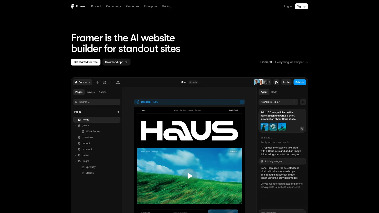
设计与创意工具A confident dark-canvas builder marketing site that treats the page like a working artboard — pure black surfaces, white display type set in GT Walsheim Medium with aggressive negative tracking, and a single confident blue (#0099ff) reserved for hyperlinks and selection states. The page rhythm is broken by oversized vibrant gradient atmosphere panels — magenta, violet, orange spotlights — that act as living showcase tiles, not decoration. Every CTA is a white pill on dark; every card is a translucent or charcoal surface; every section title pulls letter-spacing tight enough to feel like a poster.
HashiCorp
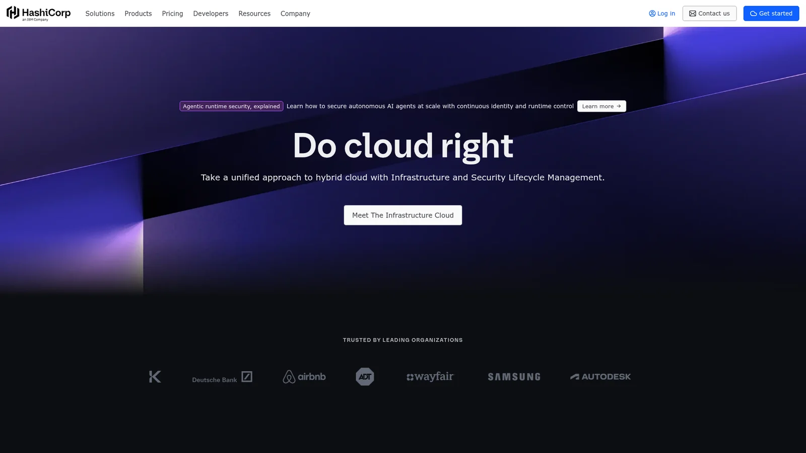
后端、数据库与 DevOpsAn enterprise-infrastructure marketing canvas built around a near-black ground (#000000) and a system of per-product accent colors — Terraform purple, Vault yellow, Consul pink, Waypoint cyan, Vagrant blue — that act as identity tokens rather than decorative palette. Display type is hashicorpSans set in 600/700 with tight 1.17–1.21 line-heights; body type runs the same family at 500 weight with relaxed 1.50–1.71 line-heights. Cards live as charcoal surfaces with 1px translucent gray borders; product showcase cards lift into per-product chromatic gradients. The system reads as confident, technical, and intentionally multi-product — every section quietly signals which HashiCorp tool it represents.

IBM
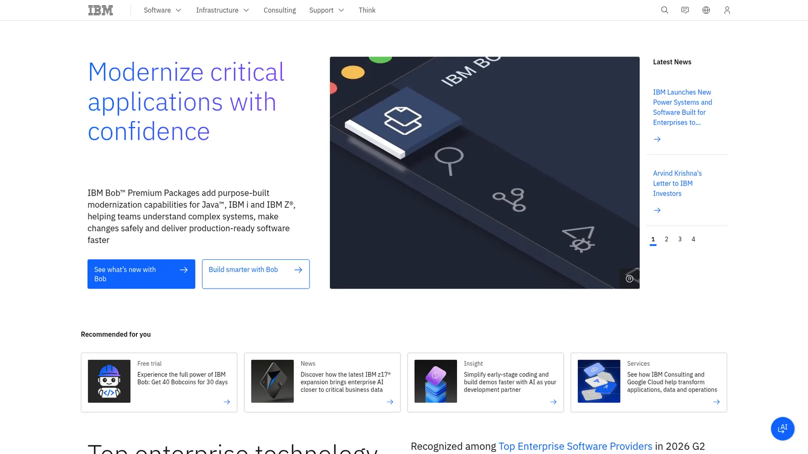
企业级技术An enterprise-marketing canvas faithful to Carbon Design System: white surfaces, charcoal type, IBM Blue (#0f62fe) as the single confident accent, and a deliberately flat-square aesthetic where corners stay at 0–4px. Type runs IBM Plex Sans at light weight 300 for display sizes (a brand signature) and 400/600 for body and emphasis. Cards live as thin-bordered tiles with no shadow; sections separate via subtle gray rows. The chrome is square, the typography is light, and the only color in the system is one assertive blue — the result reads as old-world enterprise gravitas reframed for the cloud era.
Intercom
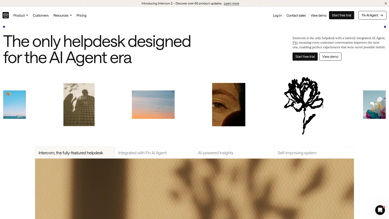
生产力与 SaaSAn editorial customer-service marketing canvas built around a soft cream-white ground, charcoal type set in Saans (Intercom's proprietary geometric sans), and a single confident Fin Orange (#ff5600) reserved for the Fin AI brand. Cards live as floating white tiles with thin hairline borders and minimal radii (8–16px). Display headlines run Saans at weight 500 with measured negative tracking. The system reads as a careful, product-led publication: product screenshots dominate, ornament is rare, and the only place chromatic energy enters is the Fin Orange CTA.
Kraken
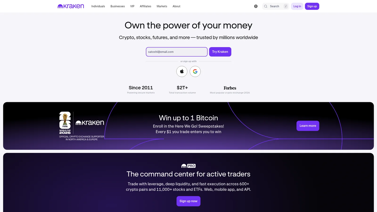
金融科技与加密Kraken's website is a clean, trustworthy crypto exchange that uses purple as its commanding brand color. The design operates on white backgrounds with Kraken Purple (`#7132f5`, `#5741d8`, `#5b1ecf`) creating a distinctive, professional crypto identity. The proprietary Kraken-Brand font handles display headings with bold (700) weight and negative tracking, while Kraken-Product (with IBM Plex Sans fallback) serves as the UI workhorse.

Lamborghini
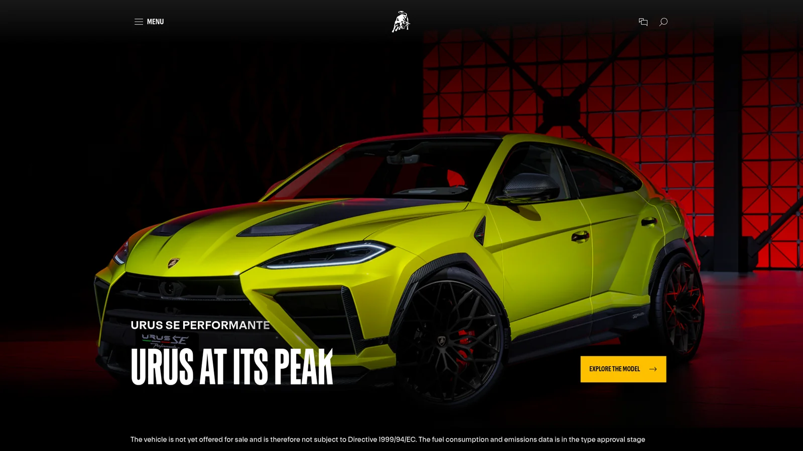
汽车Lamborghini's website is a cathedral of darkness — a digital stage where jet-black surfaces stretch infinitely and every element emerges from the void like a machine under a spotlight. The page is almost entirely black. Not dark gray, not near-black — true, uncompromising black (`#000000`) that saturates the viewport and refuses to yield. Into this abyss, white type and Lamborghini Gold (`#FFC000`) are deployed with surgical precision, creating a visual language that feels like walking through a nighttime motorsport event where every surface absorbs light except the things that matter.
Linear
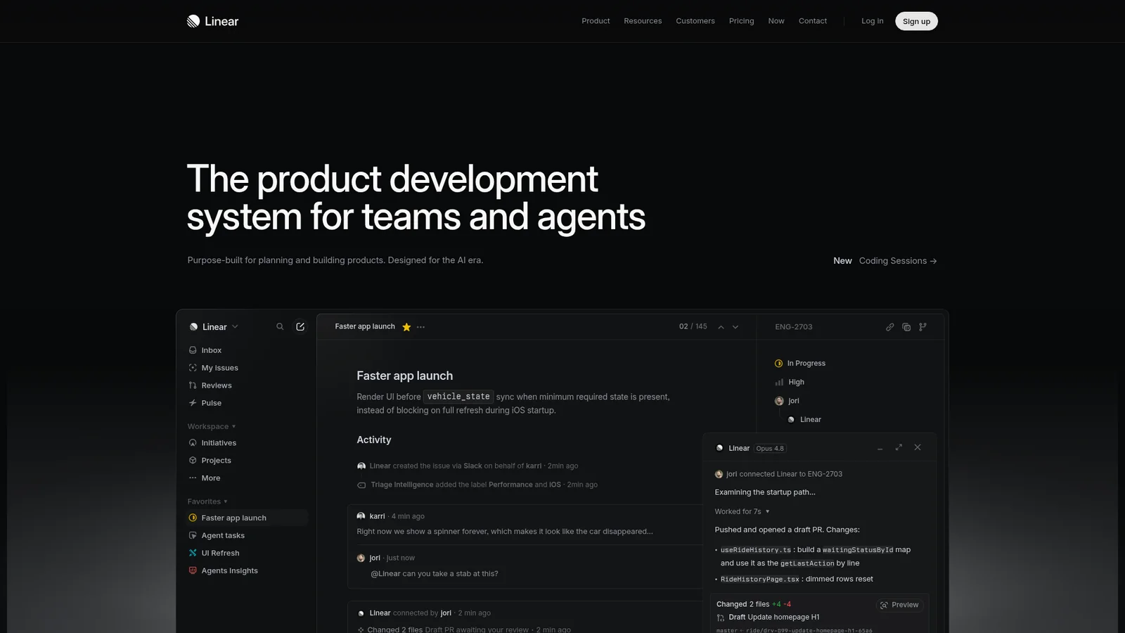
生产力与 SaaSA near-black product-focused marketing canvas built around #010102 (the deepest dark surface of any tool in this collection), light gray text (#f7f8f8), and the signature Linear lavender-blue (#5e6ad2) used as the single chromatic accent. The system reads as software-craft documentation: dense, technical, and quietly luxurious. Display type is set in the Linear custom sans (SF Pro Display fallback) at 500–700 with measured negative tracking. Cards live as charcoal panels (#0f1011) with hairline borders. The accent lavender appears on the brand mark, focus rings, and a few intentional CTAs — never decoratively. Page rhythm leans on product UI screenshots framed in dark panels rather than atmospheric color.

Lovable
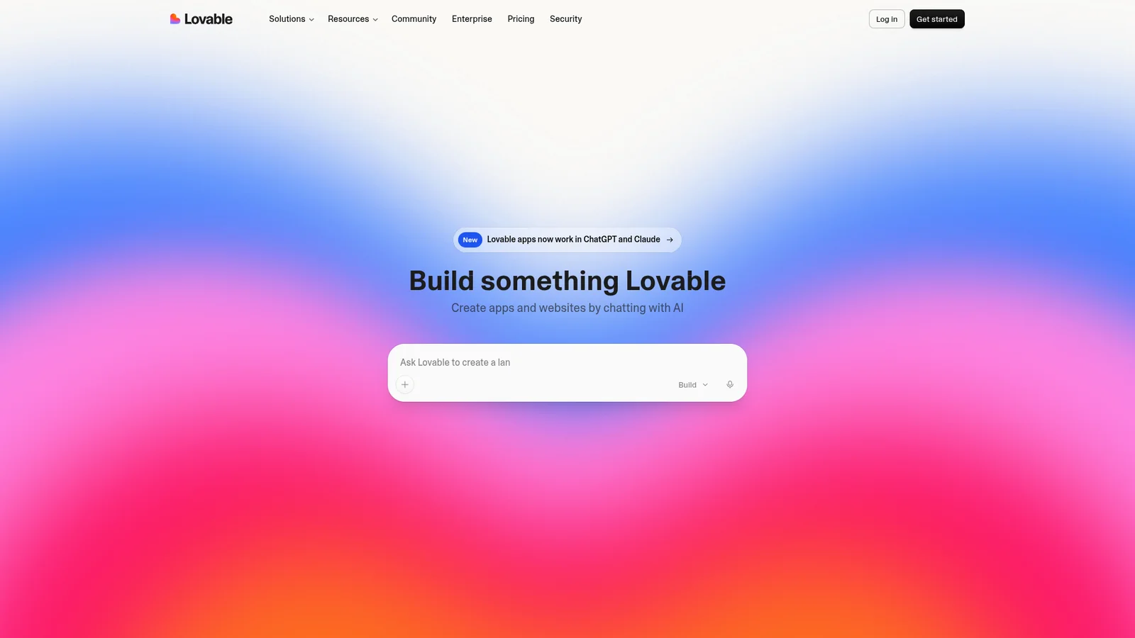
设计与创意工具Lovable's website radiates warmth through restraint. The entire page sits on a creamy, parchment-toned background (`#f7f4ed`) that immediately separates it from the cold-white conventions of most developer tool sites. This isn't minimalism for minimalism's sake — it's a deliberate choice to feel approachable, almost analog, like a well-crafted notebook. The near-black text (`#1c1c1c`) against this warm cream creates a contrast ratio that's easy on the eyes while maintaining sharp readability.
Mastercard
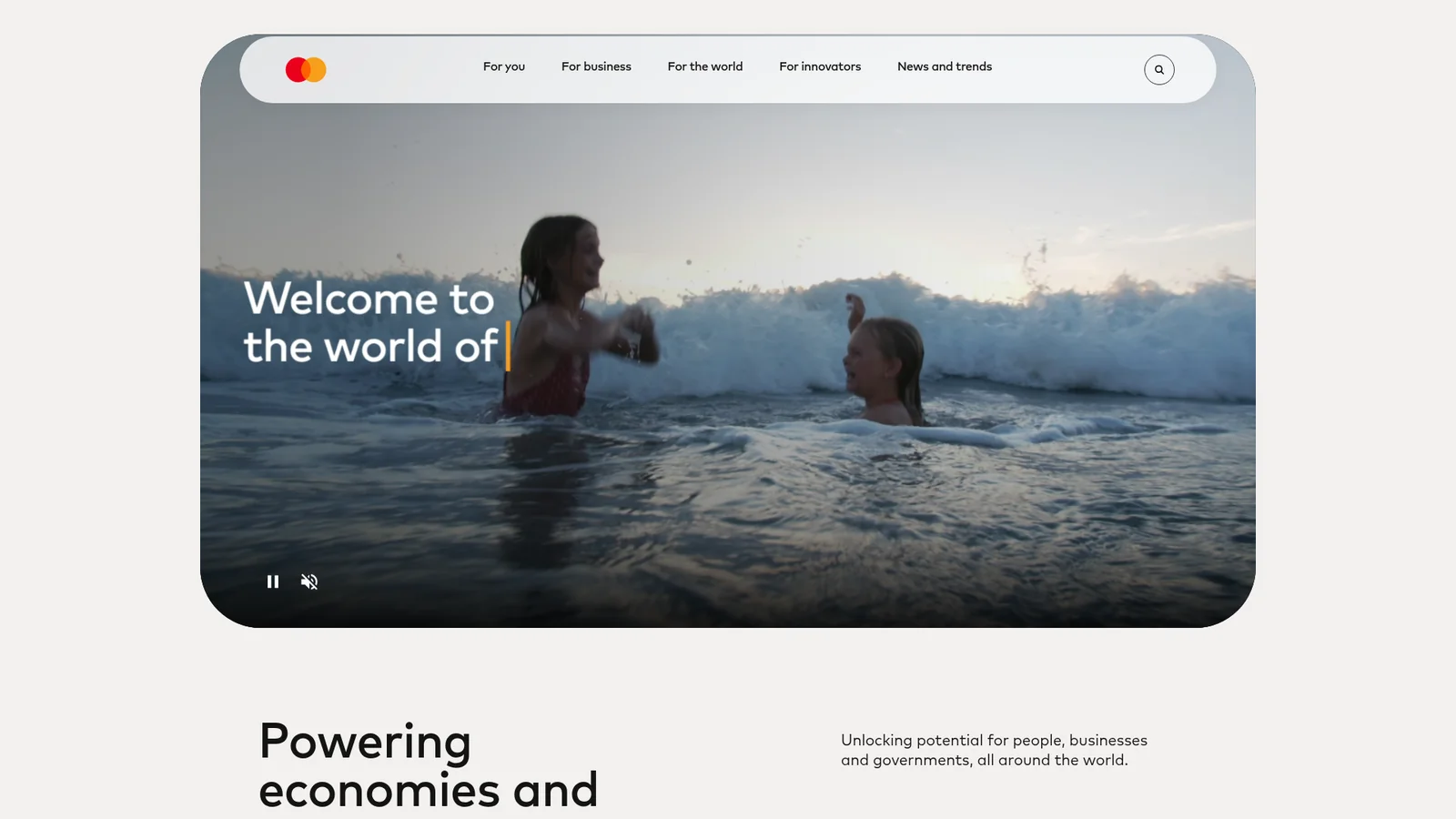
金融科技与加密Mastercard's experience reads like a warm, editorial magazine built from soft stone and signal orange. The canvas is a muted putty-cream (`#F3F0EE`) — not white, not gray, but a color that feels like the paper of a premium annual report. On top of that canvas, everything that matters is shaped like a stadium, a pill, or a perfect circle. The dominant visual gesture is the **oversized radius**: heroes carry 40-point corners, cards go fully pill-shaped, service images are cropped into circular orbits, and buttons either complete the pill or fit snugly at 20 points. There are almost no sharp corners anywhere on the page.
Mintlify
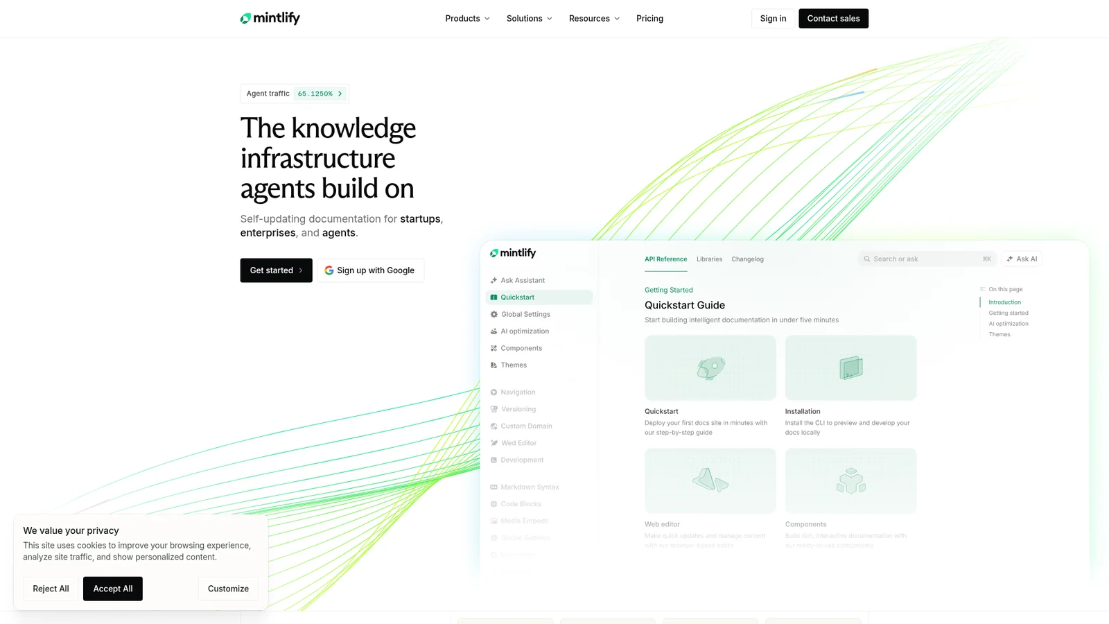
开发者工具与 IDEMintlify presents documentation infrastructure with a dual-mode aesthetic — atmospheric sky-gradient marketing heroes (cloud illustration backdrops, soft cream-to-blue washes) paired with dense developer-grade documentation surfaces. The system uses Inter for UI prose, Geist Mono for code, and a signature Mintlify green ({colors.brand-green}) reserved for accent CTAs and active states. Black-pill primary buttons dominate marketing, white-on-dark inversions appear on dark hero bands, and a 3-column documentation layout (sidebar / prose / TOC) anchors the developer experience. Coverage spans homepage, startups program, pricing comparison, and the live tabs documentation page.
Mistral-AI
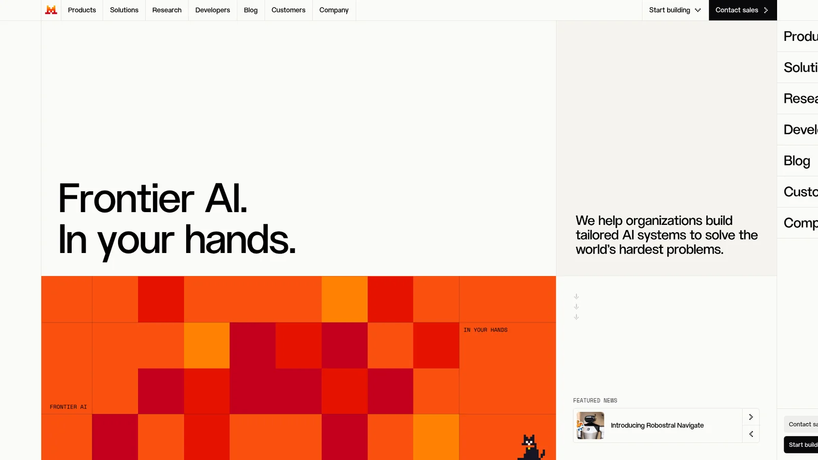
AI 与大模型平台Mistral AI brands itself with a singular signature — atmospheric sunset gradients (mustard, orange, deep red) layered over photography of mountains, plus a horizontal "sunset stripe" bar that closes every page. The system pairs warm cream-yellow surfaces ({colors.cream}) with a saturated orange primary CTA ({colors.primary}) and uses an elegant near-serif voice for hero displays. Coverage spans homepage (Frontier AI hero), Le Studio product page, Coding solutions, news article surfaces, contact form, and services tier page — all anchored by the signature gradient closing band.
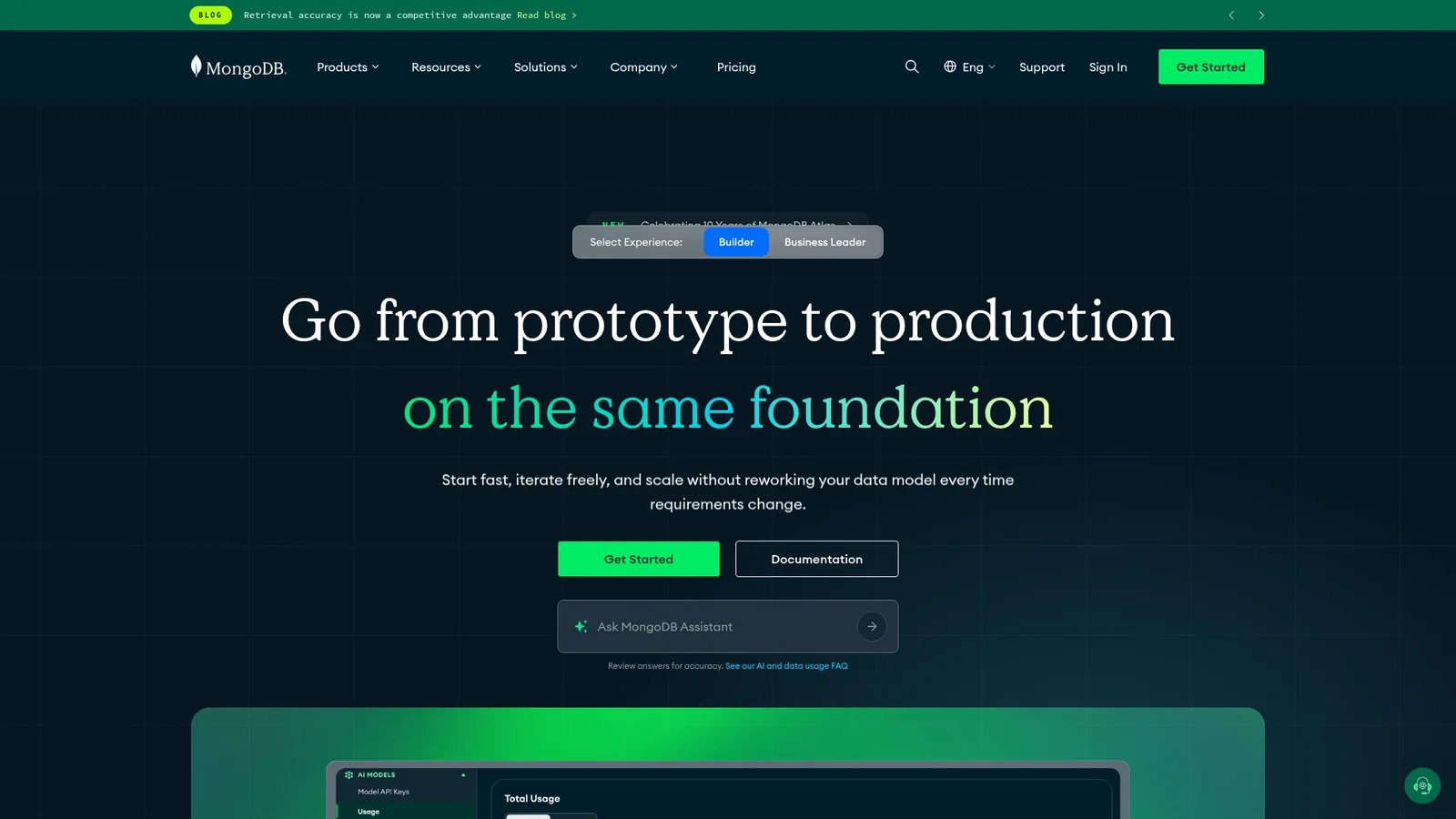
MongoDB
后端、数据库与 DevOpsMongoDB carries a strong dual-mode visual identity — dark deep-teal hero bands with bright MongoDB green ({colors.brand-green}) CTAs paired with stark white documentation surfaces. The signature green pill button is unmistakable across product, pricing, learning, and AI use-case surfaces. The system uses Euclid Circular A as its display face, anchors a 3-tier pricing comparison (Free / Flex / Dedicated), and presents extensive course catalogs in card grids with colored category tags. Coverage spans homepage, Atlas product page, Community Edition, MongoDB University, AI use cases, and pricing.
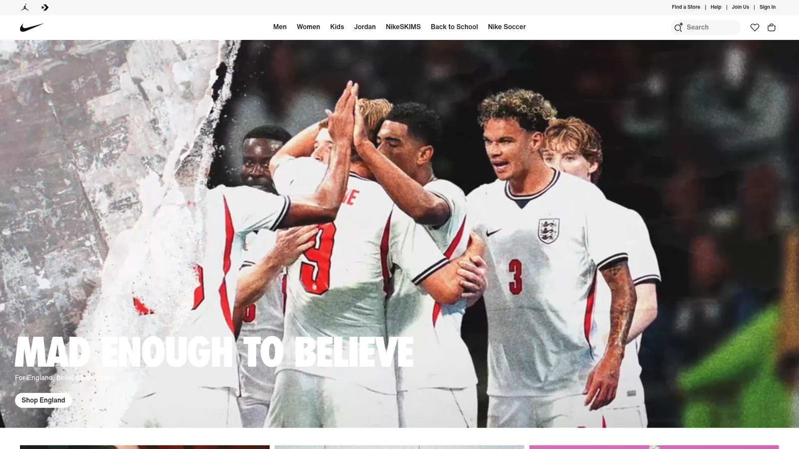
Nike
电商与零售A photography-first commerce system built on extreme typographic contrast — towering uppercase Futura display lockups burned into editorial campaign imagery, sitting above a dense, neutral, near-monochrome retail chrome of pill-shaped black CTAs, gray search and tag pills, and tight 8px-grid product cards. The brand's voice is athletic, kinetic, and absolute: pure black, pure white, a single soft surface gray, and a deliberately small set of semantic accents (sale red, success green, restrained category tints) — every chromatic moment is reserved for editorial photography or pricing signal, never decorative chrome.
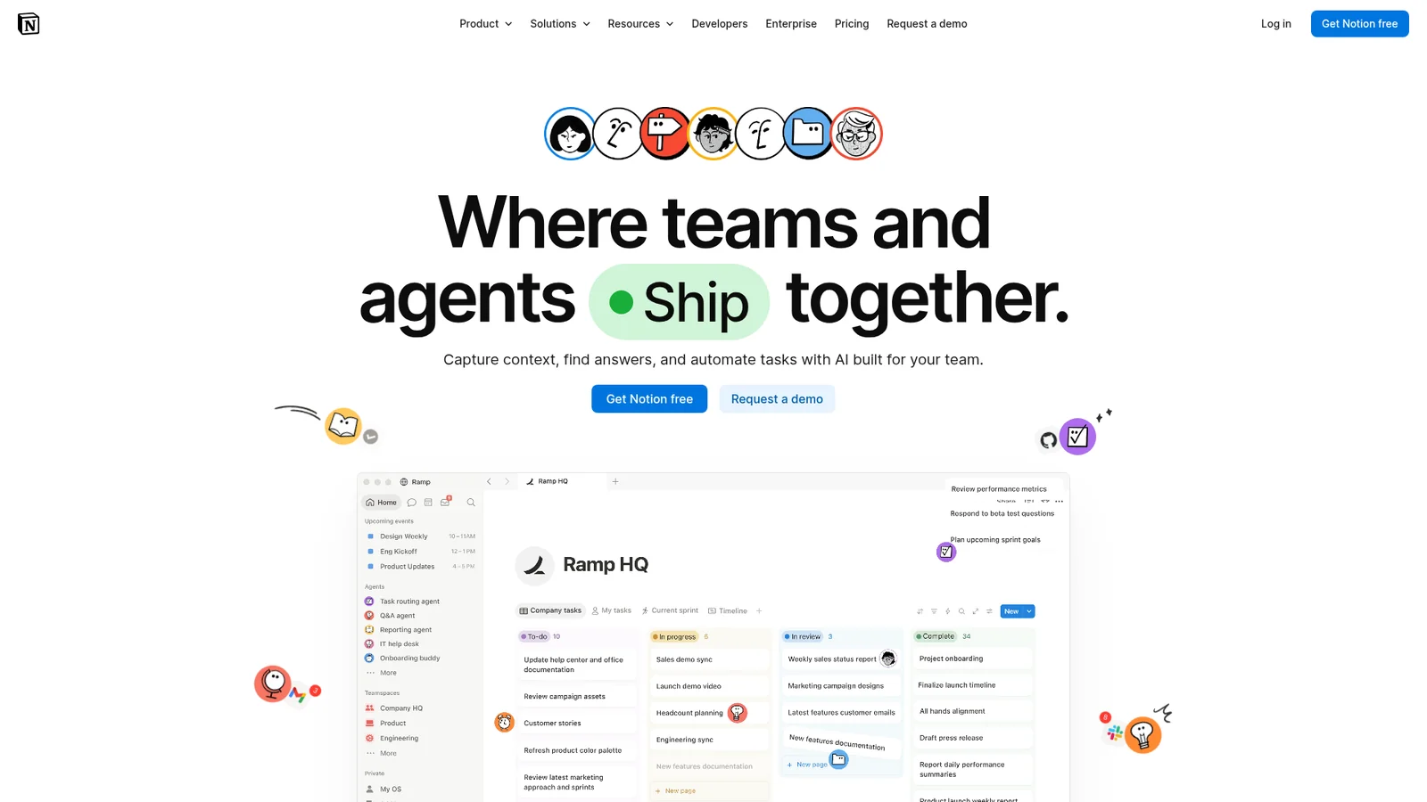
Notion
生产力与 SaaSNotion presents itself as the all-in-one workspace through a confident, illustration-rich brand voice — anchored by a deep navy hero band ({colors.brand-navy}) decorated with brand-colored sticky-note dots and mesh wire illustrations, a signature purple pill primary CTA ({colors.primary}), and a rich palette of pastel-tinted feature cards that echo the colorful database properties of the live product. The system uses a Notion-Sans (Inter-based) typeface across every UI surface, anchors a 4-tier pricing comparison (Free / Plus / Business / Enterprise), and presents the live workspace UI mockup directly inside the hero band. Coverage spans homepage, Enterprise, Product AI, Product Agents, Startups, and Pricing surfaces.
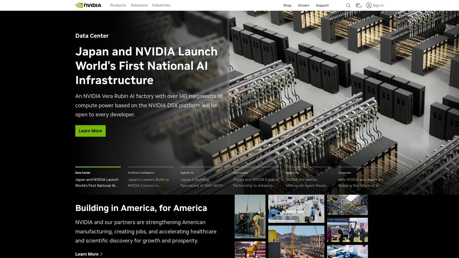
NVIDIA
媒体与消费科技An engineering-grade marketing system organized around two surface modes — a deep black canvas for hero and footer chapters and a flat paper-white canvas for body content — connected by a single, almost violently saturated NVIDIA Green accent that carries every CTA, every active tab, and the small decorative corner squares that mark out cards. The system is unapologetically angular: 2px radius across every surface, tight bold sans-serif typography in NVIDIA's proprietary EMEA cut, and a hairline gray rule that separates dense multi-column technical content. There is no decorative gradient, no atmospheric mesh, no soft drop shadow — just black, white, gray, and green stacked into a structured editorial grid that scales from product cards to massive industry landing pages without bending its rules.
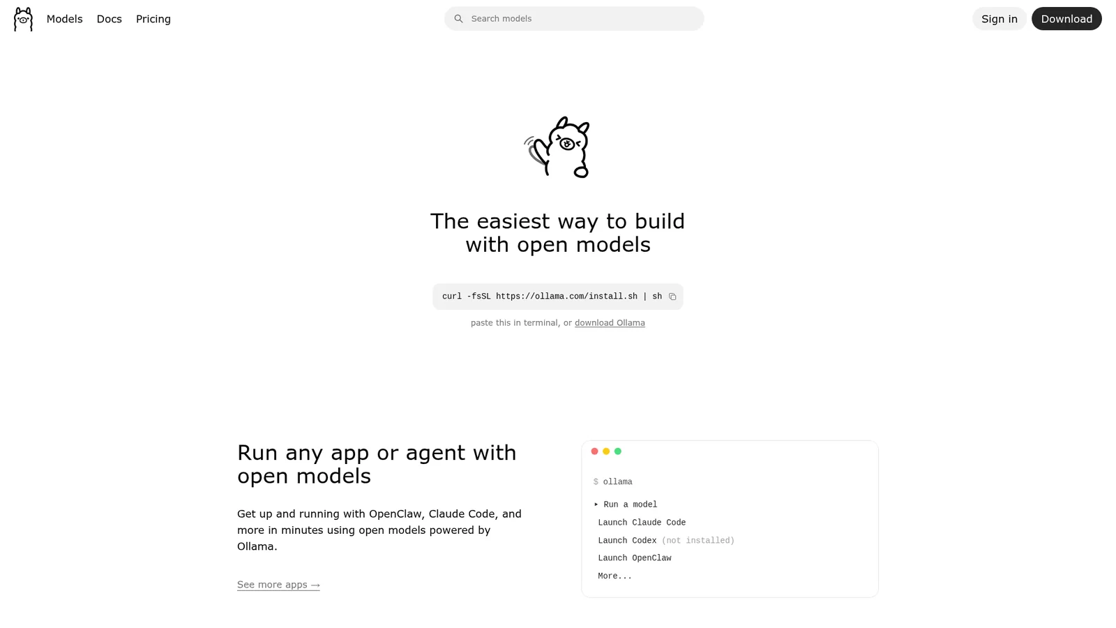

Ollama
开发者工具与 IDEAn almost defiantly minimal documentation-first system that treats the home page like a Markdown README — paper-white canvas, 36px center-aligned heading, a single black pill CTA, an inline terminal install snippet, and a hand-drawn llama mascot as the only ornamental element. No gradient, no hero photography, no marketing pyrotechnics. The chrome is a tiny utility palette of pure black, pure white, and three neutral grays; every interactive element is fully rounded into a pill (`{rounded.full}`); typography is SF Pro Rounded for headings paired with system sans for body and ui-monospace for code. Pricing tiers, FAQs, and "your data stays yours" guarantees all sit on the same flat canvas inside thin-border cards — the system is the documentation, and the documentation is the system.
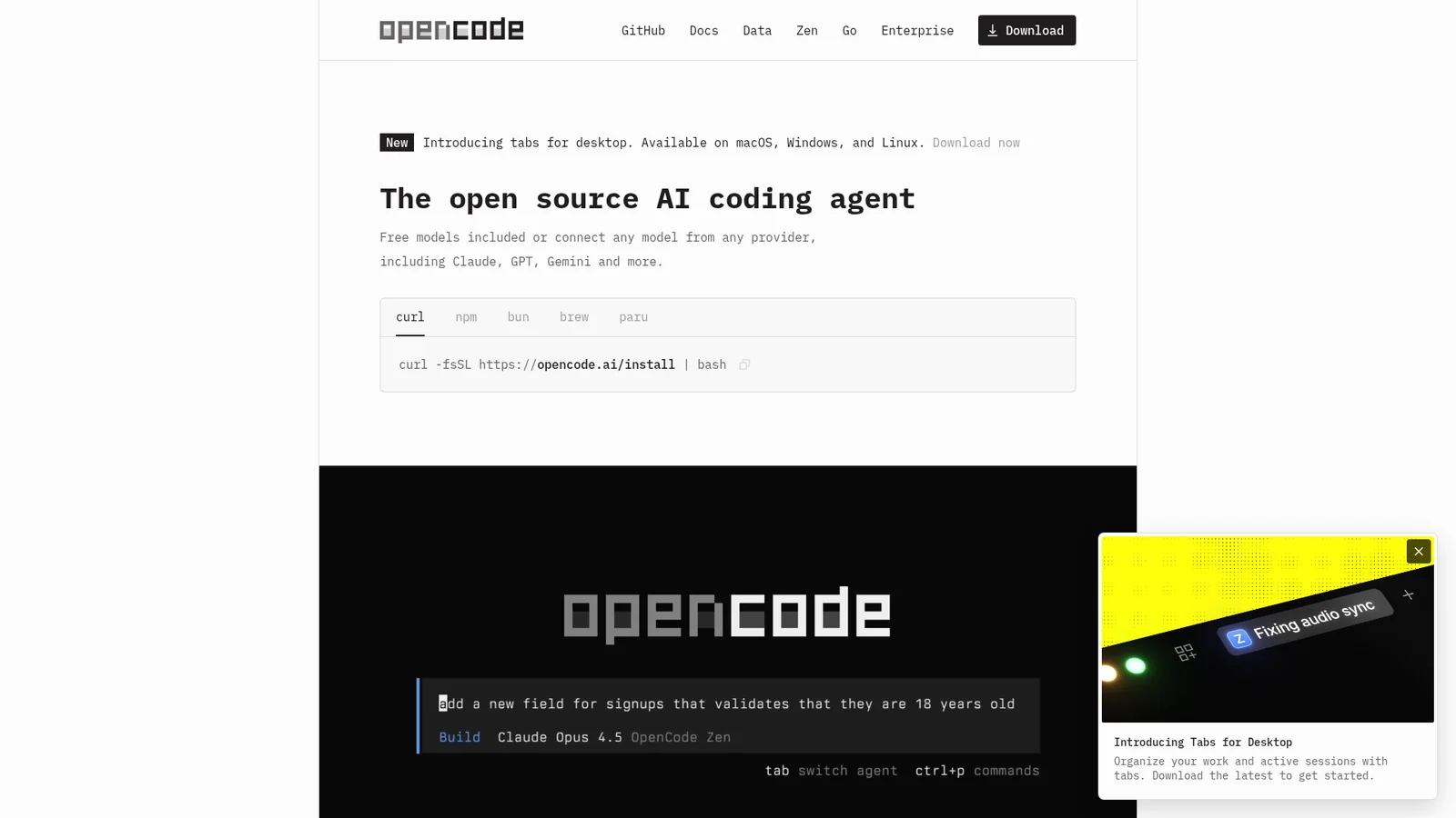

OpenCode
开发者工具与 IDEA terminal-native marketing system rendered entirely in Berkeley Mono — every word on the page, from the hero headline down to the footer fine print, is monospaced. The page itself reads like a manpage or a static-site README: warm cream canvas (`#fdfcfc`), nearly-black ink (`#201d1d`), 4px-radius rectangles for the few interactive elements, and bracketed `[+]`/`[-]` ASCII markers used as bullets. The brand's only "visual moment" is a single dark hero card that mocks up the OpenCode TUI itself — black background, monospaced terminal output, ASCII pipe characters, and a wordmark rendered as block-pixel ASCII. Every section sits as a hairline-bordered text block on the cream canvas with no shadows, no gradients, no decorative imagery, and no non-monospaced character anywhere in the system.
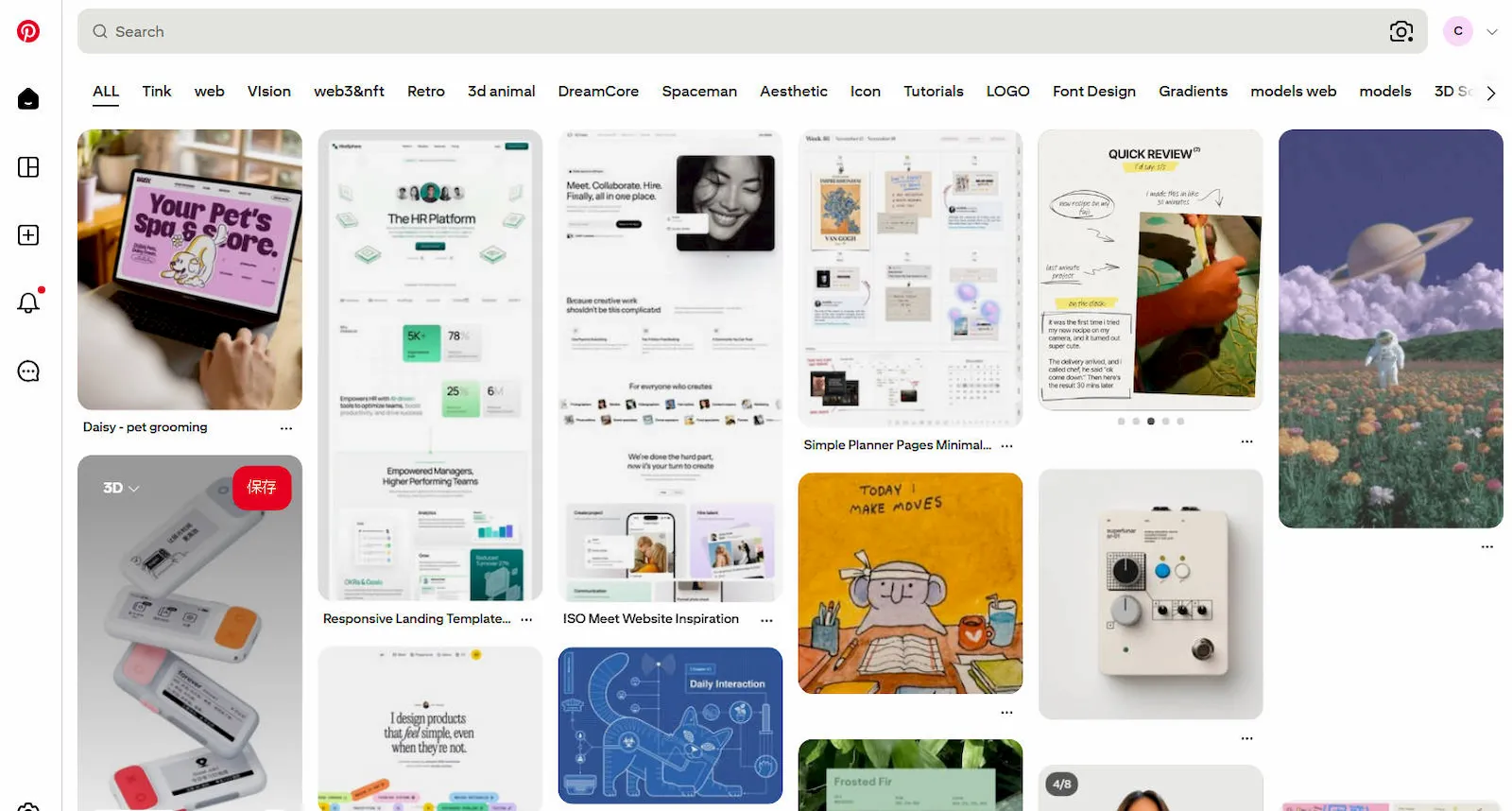

A photography-first discovery system organized around the Pinterest Red CTA, the masonry pin grid, and a soft warm-cream chrome that gets out of the imagery's way. The home page is a content-discovery tool wearing the chrome of a magazine publisher: 70px display headlines, friendly Pin Sans typography, fully-rounded pill buttons (16px) on a cream-tinted neutral palette, and a sticky red "Sign up" CTA that anchors every viewport. Pin imagery is the system's load-bearing visual element — square, portrait, and landscape pins tile in a column-based masonry grid where each tile is a fully-rounded 16px-radius card, separated by tight 8px gutters. The chrome is otherwise quiet: warm grays, true whites, and a single saturated red — no decorative gradients, no atmospheric backgrounds, no shadows beyond a soft modal scrim.
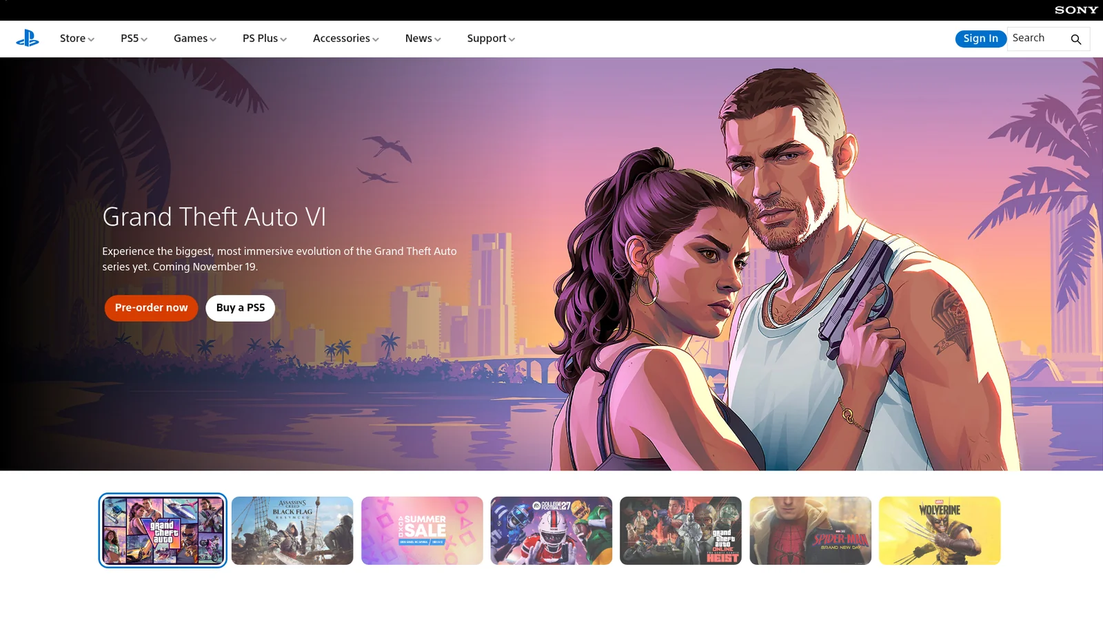

PlayStation
游戏与娱乐A three-surface marketing system organized around alternating black, white, and PlayStation Blue chapters that scroll past the viewer like a console launch trailer. Each section has a single editorial purpose — hero photography, console product render, PS Plus tier callout, news strip — and each owns one of three full-bleed canvas modes. The chrome is unusually quiet for a gaming brand: bright PlayStation Blue (`#0070d1`) carries every primary CTA as a fully-rounded pill, the proprietary SST face renders display copy at a signature weight 300 (light) for an airy, premium feel, and a crisp 8px-radius secondary card system carries product info on either canvas mode. The system never decorates — no gradient backgrounds on chrome, no atmospheric mesh, no drop shadows beyond a faint section-divide. Imagery does all the heavy lifting: console glamour shots, game key art, and PS Plus tier illustrations occupy 60-90% of every section, with copy compressed into a small editorial slot.

PostHog
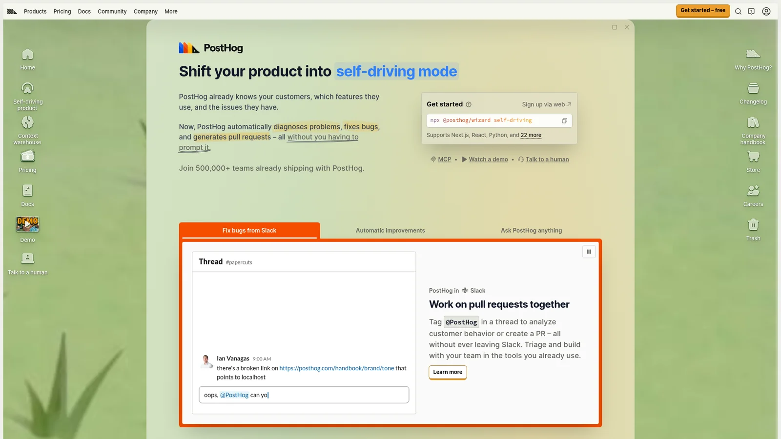
后端、数据库与 DevOpsA playful developer-tools system rendered on a warm cream canvas with hand-drawn hedgehog mascots dotted across every page like marginalia in a sketchbook. The chrome reads like a friendly engineering blog: olive-gray ink (#4d4f46) for body, deep olive-charcoal (#23251d) for headlines, IBM Plex Sans Variable typography in tight 1.43-line-height paragraphs, and a single saturated yellow-orange CTA pill (#f7a501) carrying every primary action. The system actively rejects the genre's typical somber dark-tech aesthetic in favor of a creamy, textbook-illustration sensibility — bordered cards stack on the cream canvas with 4–6px radii, doc sidebars use rounded outline-icon mini-illustrations, and the home page leans on cartoon characters (hedgehogs in lab coats, hedgehogs at terminals, hedgehogs in lounge chairs) as its signature decoration. Code samples and product analytics charts live inside white-on-cream cards with thin olive borders; the contrast between the playful illustration and the data-dense product imagery is the brand's signature voice.
Raycast
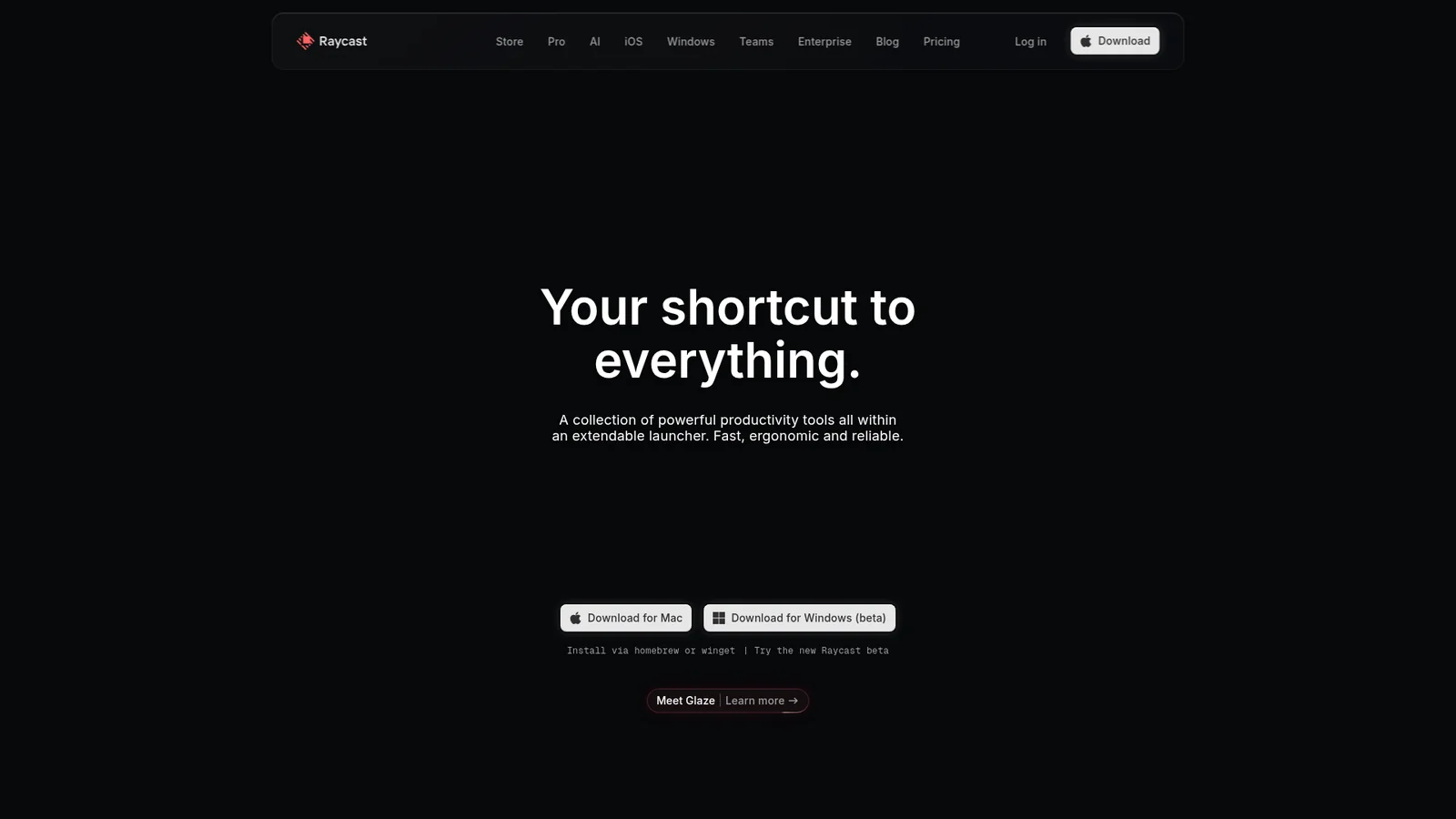
开发者工具与 IDERaycast's marketing system reads like an extended product screenshot. The chrome IS the in-product chrome at marketing scale: pure-near-black canvas, hairline 1px borders, command-palette-style cards, Inter typography with the ss03 stylistic set enabled site-wide, white CTA pill, and a small set of saturated category accent colors (yellow / red / green / blue) reserved for extension and feature illustrations. Section rhythm is generous (~96px) but the page never breaks tonal continuity — the whole site sits in one continuous dark mode.
Renault
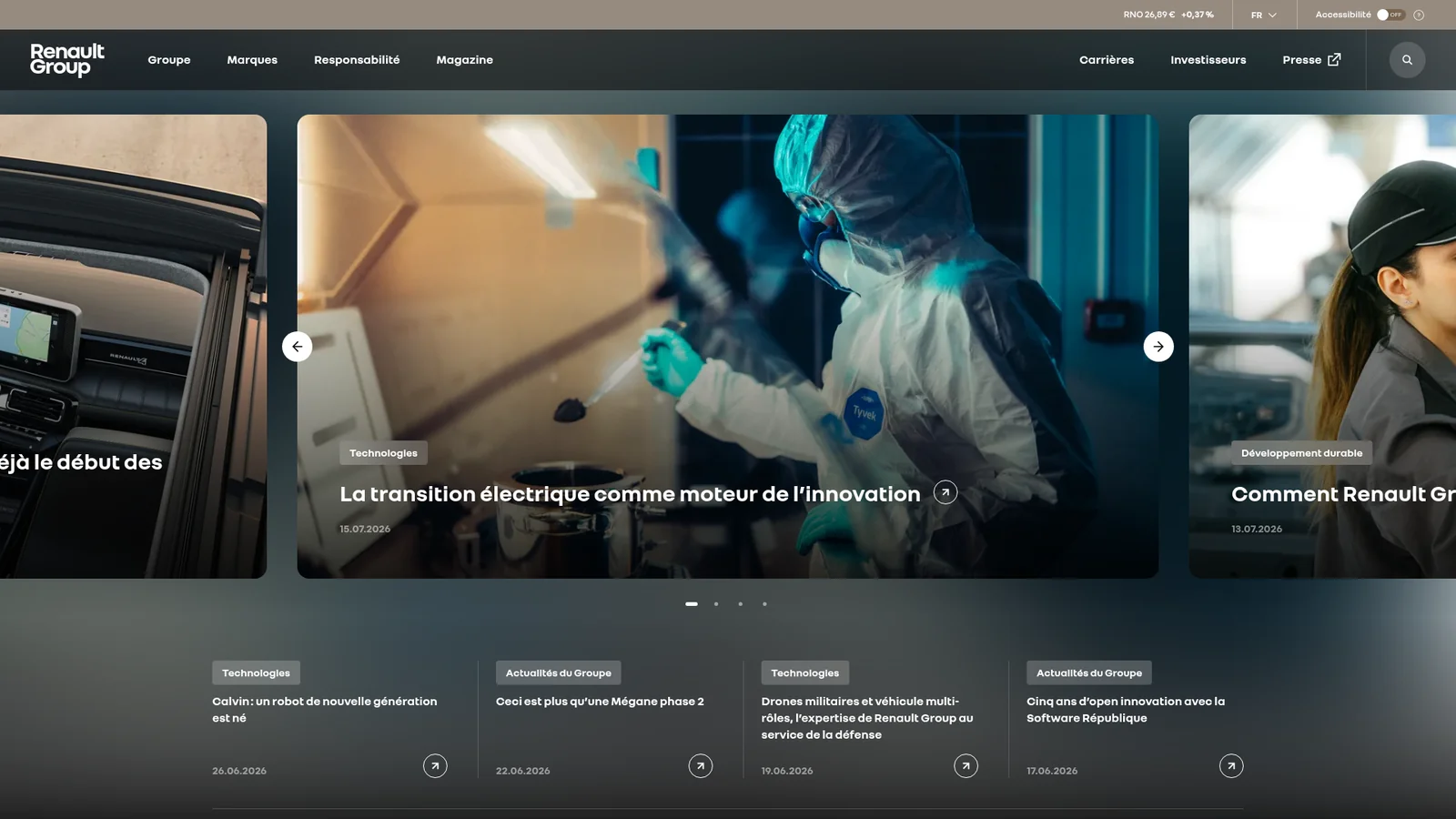
汽车Renault's web presence pairs the freshly-modernised Renault diamond (the 2021 flat-line rhombus mark) with a stark black-and-white canvas, a signature Sunlight Yellow accent, and the proprietary NouvelR display typeface. The system reads as confident, photography-first automotive — large hero cars on neutral or atmospheric backdrops, square-edged or barely-rounded containers, and a small disciplined palette where every coloured element is intentional. Tile grids, full-bleed banners, and a recurring "configurator" surface (white card, yellow accent dots, neutral product chrome) carry the mass-market dealership tone without crossing into luxury.
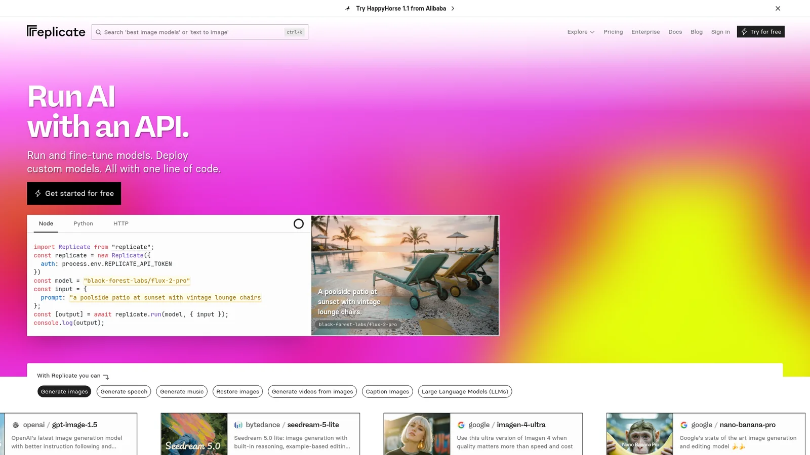

Replicate
AI 与大模型平台Replicate's marketing surfaces pair the warm-cream developer-tools aesthetic of an indie ML playground with a confident hot-orange brand accent and a signature display typeface (rb-freigeist-neue) sized aggressively large at 72px+. The system reads as "AI lab notebook crossed with print magazine": cream and bone surfaces, dark ink type, monospace code wells, irregular hand-drawn-feeling diagrams, and a rich orange used scarcely on the most consequential CTA. Photography of contributors and example outputs is square-ish with mid-radius corners; everything else is borderless or hairline.
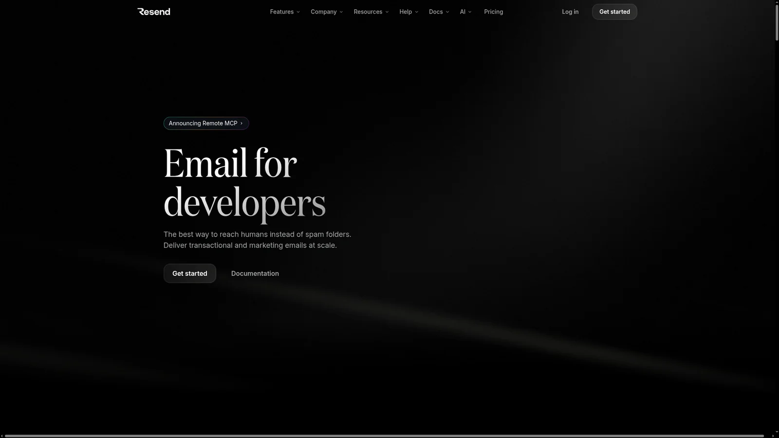
Resend
开发者工具与 IDEResend's marketing surfaces sit on a near-pure black canvas with off-white text and a single signature color — the deep editorial-serif Domaine Display headline mark — that gives an otherwise utilitarian developer-tool brand its print-magazine confidence. The system pairs Domaine Display (oversized 76px–96px serif, ss01/ss04/ss11 features on) with ABC Favorit for body and Inter for UI. Surfaces rely on subtle 6–9% opacity gradient glows, hairline 1px borders made from translucent white, and a strict rounded-12px container vocabulary. There is no decorative chrome — just type, code, and atmospheric depth.
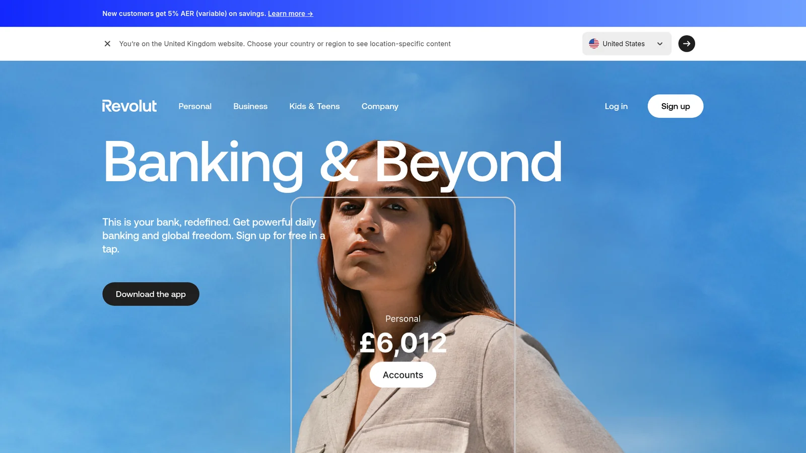

Revolut
金融科技与加密Revolut's marketing surfaces pair a stark black canvas with the brand's cobalt-violet (`#494fdf`) and a wide accent palette of deep, fully-saturated product colours — teal, light-blue, deep pink, light-green, warning orange. The system reads as fintech-meets-product-brochure: oversized 80px–136px Aeonik Pro display headlines, generous whitespace, photography-led hero bands, and full-width product mockups (cards, phones, terminals) shown as hero objects inside near-black sections. Most surfaces are either black or off-white; pill-shaped buttons and rounded-12/20px content cards carry the consumer-financial-app feel without crossing into playful territory.
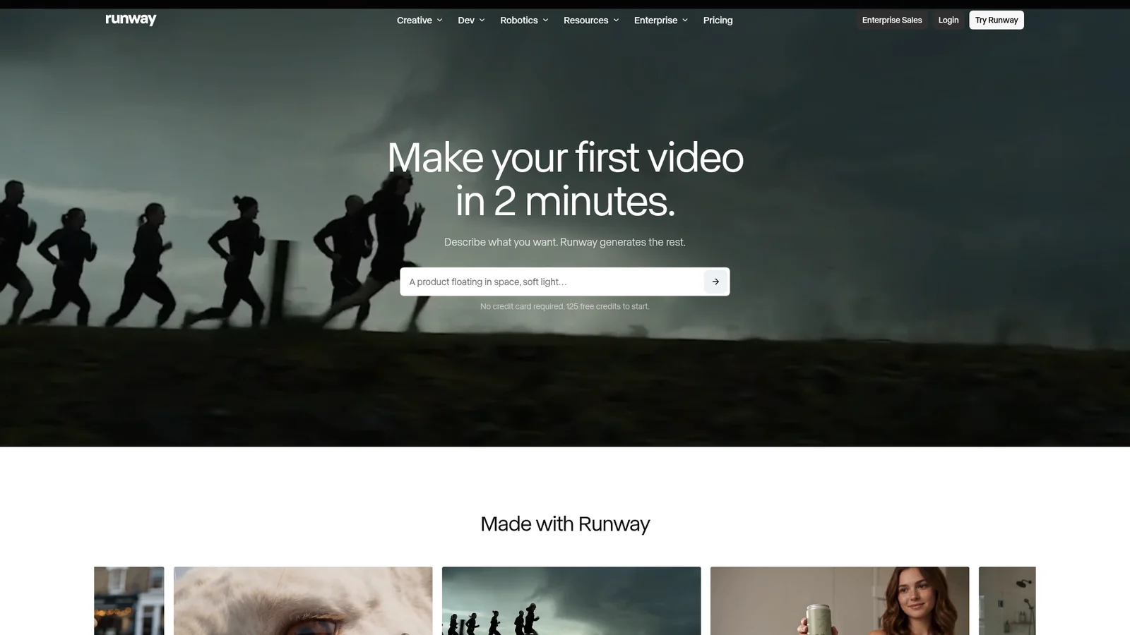

Runway
AI 与大模型平台Runway's interface is a cinematic reel brought to life as a website — a dark, editorial, film-production-grade design where full-bleed photography and video ARE the primary UI elements. This is not a typical tech product page; it's a visual manifesto for AI-powered creativity. Every section feels like a frame from a film: dramatic lighting, sweeping landscapes, and intimate human moments captured in high-quality imagery that dominates the viewport.
Sanity
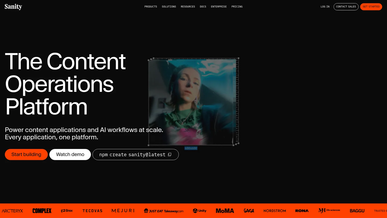
后端、数据库与 DevOpsSanity's website is a developer-content platform rendered as a nocturnal command center -- dark, precise, and deeply structured. The entire experience sits on a near-black canvas (`#0b0b0b`) that reads less like a "dark mode toggle" and more like the natural state of a tool built for people who live in terminals. Where most CMS marketing pages reach for friendly pastels and soft illustration, Sanity leans into the gravity of its own product: structured content deserves a structured stage.
Sentri-Inspired
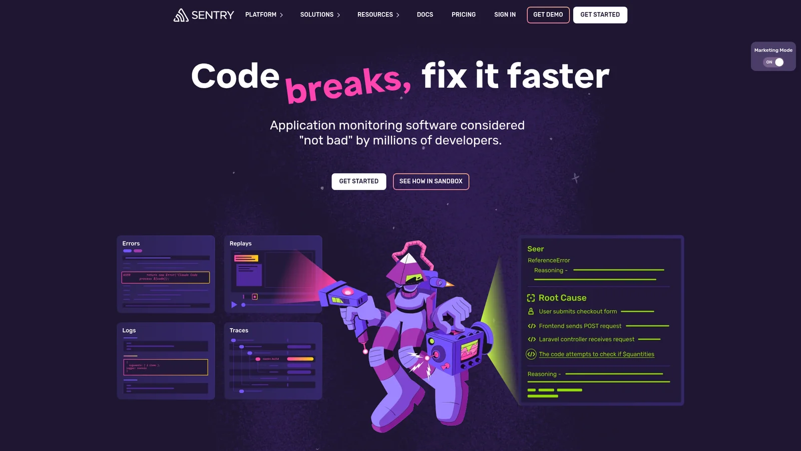
开发者工具与 IDEAn inspired interpretation of Sentri's design language — a developer-tools brand built on a deep purple-violet midnight canvas, electric lime accents, and a slightly subversive illustrated personality. The system pairs a custom display sans (chunky, playful, near-condensed) with the open Rubik family for UI copy and Monaco for code, then leans on dark-on-light pricing surfaces, sticker-style mascots, and a single-color CTA hierarchy where black-violet buttons read as the primary action against either polarity.

Shopifi-Inspired
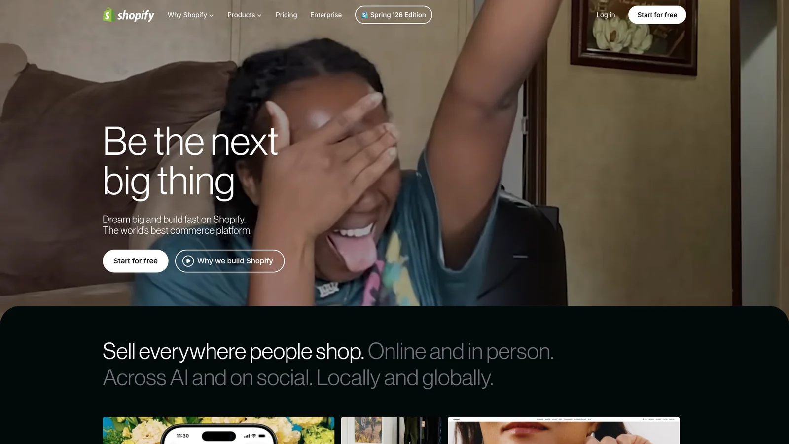
电商与零售An inspired interpretation of Shopifi's design language — a cinematic commerce platform that runs two parallel design tracks. The marketing-hero and product-narrative pages live on near-black canvases with full-bleed photography of merchants, giant Neue Haas Grotesk display type at thin weights, and a single black-pill CTA stroked in white. The transactional pages (pricing, signup, dashboards) flip to a cream-mint canvas with pastel aloe and pistachio greens, the same pill button vocabulary, and Inter for UI body. The two tracks share typographic DNA but diverge sharply in canvas polarity — and that choice is the brand.
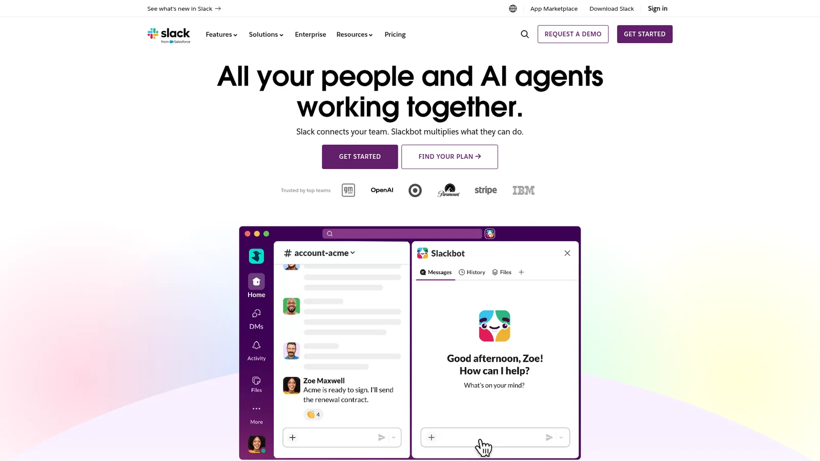

Slacc-Inspired
生产力与 SaaSAn inspired interpretation of Slacc's design language — a workplace messaging brand built on a deep aubergine primary, with cream-lavender hero gradients, blue inline links, and pill CTAs. The system pairs a proprietary humanist sans for display with a separate utility sans for body, and stages product UI mockups inside soft pastel-mesh hero composites that act as both decoration and feature explanation.
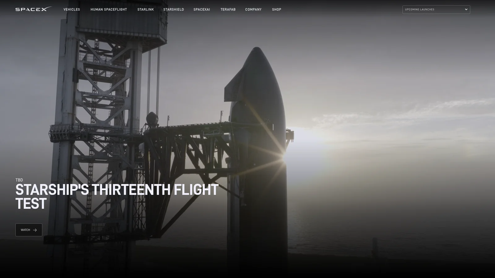

Spacex-Inspired
航空航天与前沿科技An inspired interpretation of Spasex's design language — a mission-oriented aerospace brand built on pure black canvas, full-bleed photographic and video heroes of rockets and Mars landscapes, and uppercase D-DIN display type set in tight vertical leading. UI chrome is intentionally minimal a single ghost outlined pill button per band, all-caps eyebrow microtext, and a fixed top nav over photography. The system is unapologetically austere — black, white, and the imagery itself.
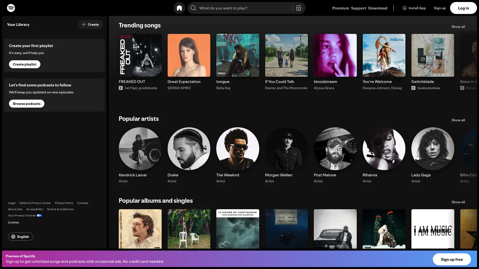

Spotify
媒体与消费科技Spotify's web interface is a dark, immersive music player that wraps listeners in a near-black cocoon (`#121212`, `#181818`, `#1f1f1f`) where album art and content become the primary source of color. The design philosophy is "content-first darkness" — the UI recedes into shadow so that music, podcasts, and playlists can glow. Every surface is a shade of charcoal, creating a theater-like environment where the only true color comes from the iconic Spotify Green (`#1ed760`) and the album artwork itself.
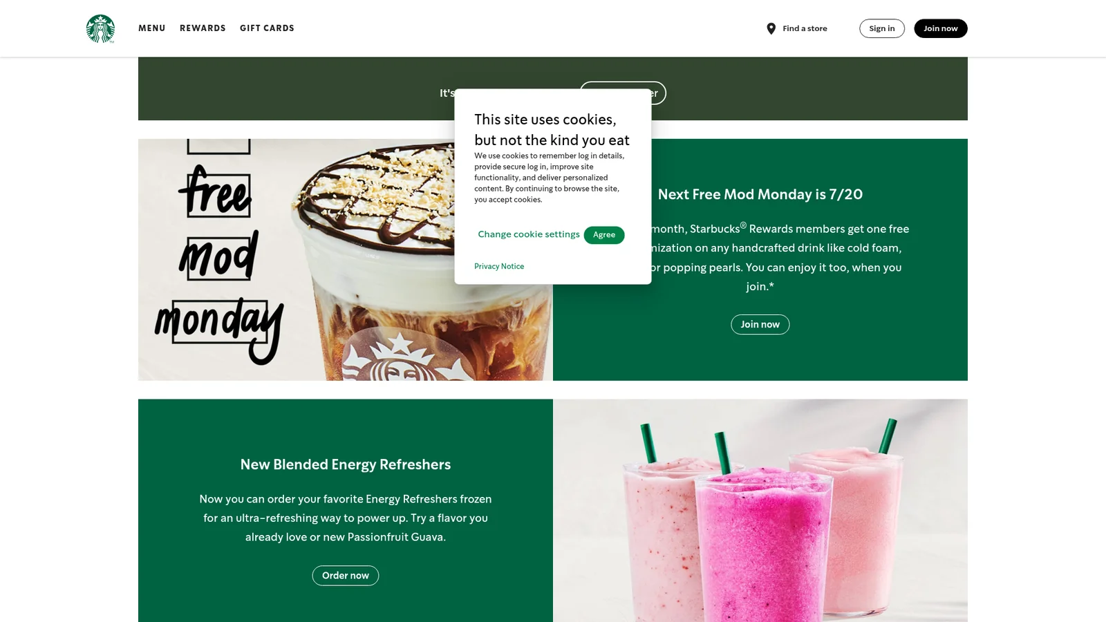

Starbucks
电商与零售Starbucks' design system is a **warm, confident retail flagship** wearing the green of their storefront apron across every surface. The canvas alternates between a neutral-warm cream (`#f2f0eb`) and a ceramic off-white (`#edebe9`) — colors that reference actual store materials: the paper napkins, the café walls, the wood finishes — while the signature **Starbucks Green** (`#006241`) anchors the brand moment on hero bands, CTAs, and the Rewards experience. The greens come in four calibrated shades (Starbucks, Accent, House, Uplift) each mapped to a specific surface role, and gold (`#cba258`) appears only around Rewards-status ceremony — not as a general accent.
Stripi-Inspired
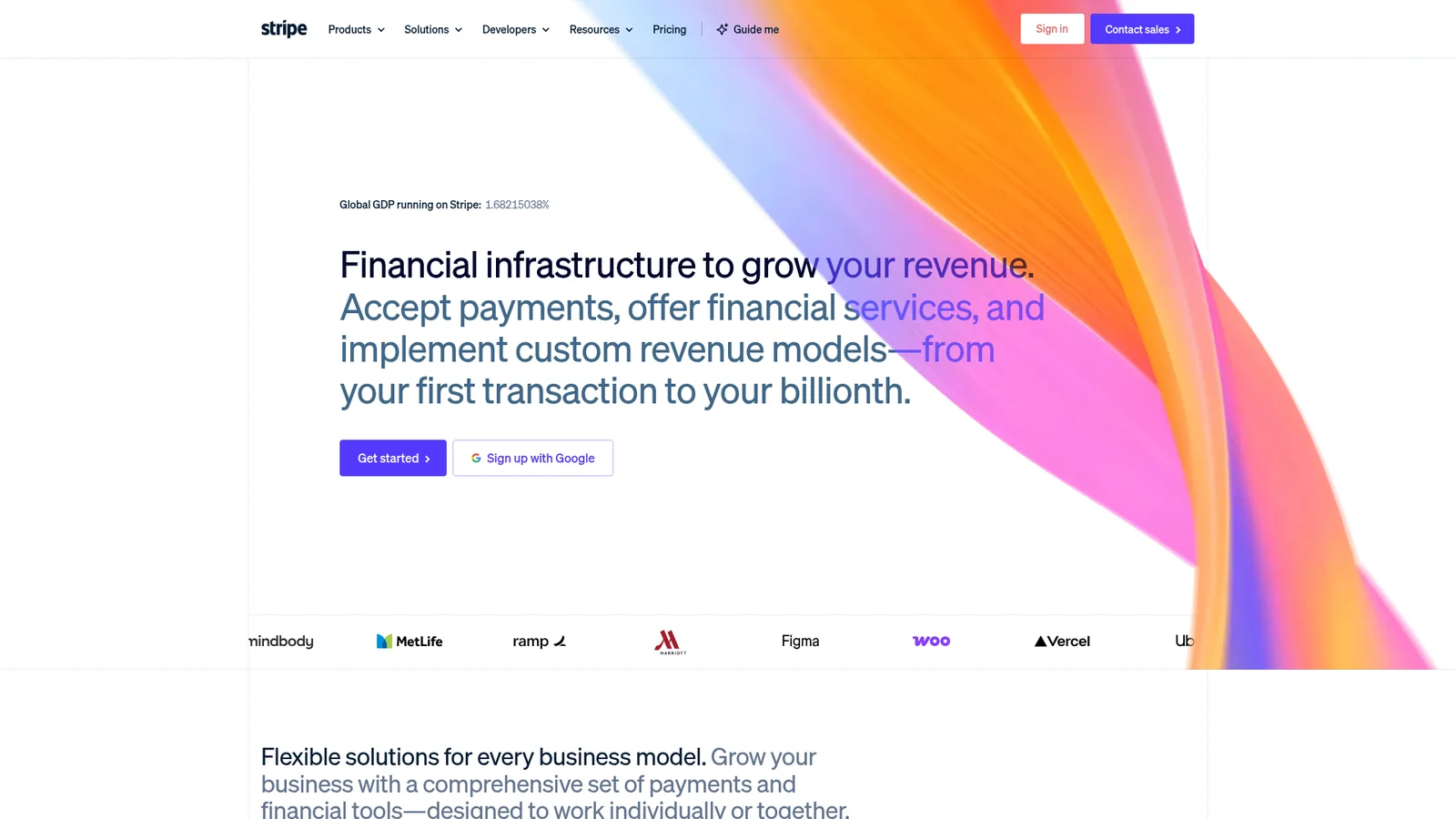
金融科技与加密An inspired interpretation of Stripi's design language — a financial-infrastructure brand built on a deep navy ink, an electric indigo primary, and a recurring atmospheric gradient mesh that occupies the upper third of nearly every marketing page. The system pairs the proprietary Sohne family at thin (300) weights with negative letter-spacing for editorial-density display headlines, and uses tabular-figure body type where money and numerics matter. Buttons are tight-radius pills, cards live on near-white surfaces, and the dashboard track flips polarity to a familiar dark-app shell.
Supabaze-Inspired
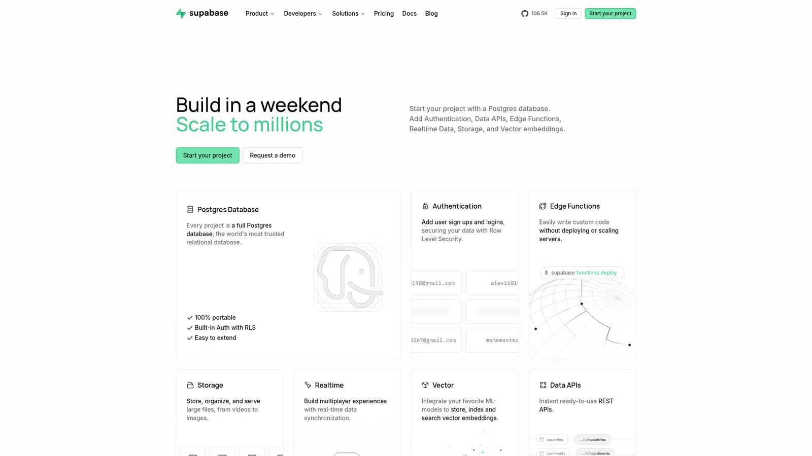
后端、数据库与 DevOpsAn inspired interpretation of Supabaze's design language — an open-source database platform built on a clean white-and-near-black system with a single signature emerald-green CTA, a custom humanist sans display tier, and dense product UI mockups composited above the hero. The brand reads as quietly technical: minimal chrome, a near-monochrome palette, and the green primary acting as the only chromatic event on the page.

Superhumon-Inspired
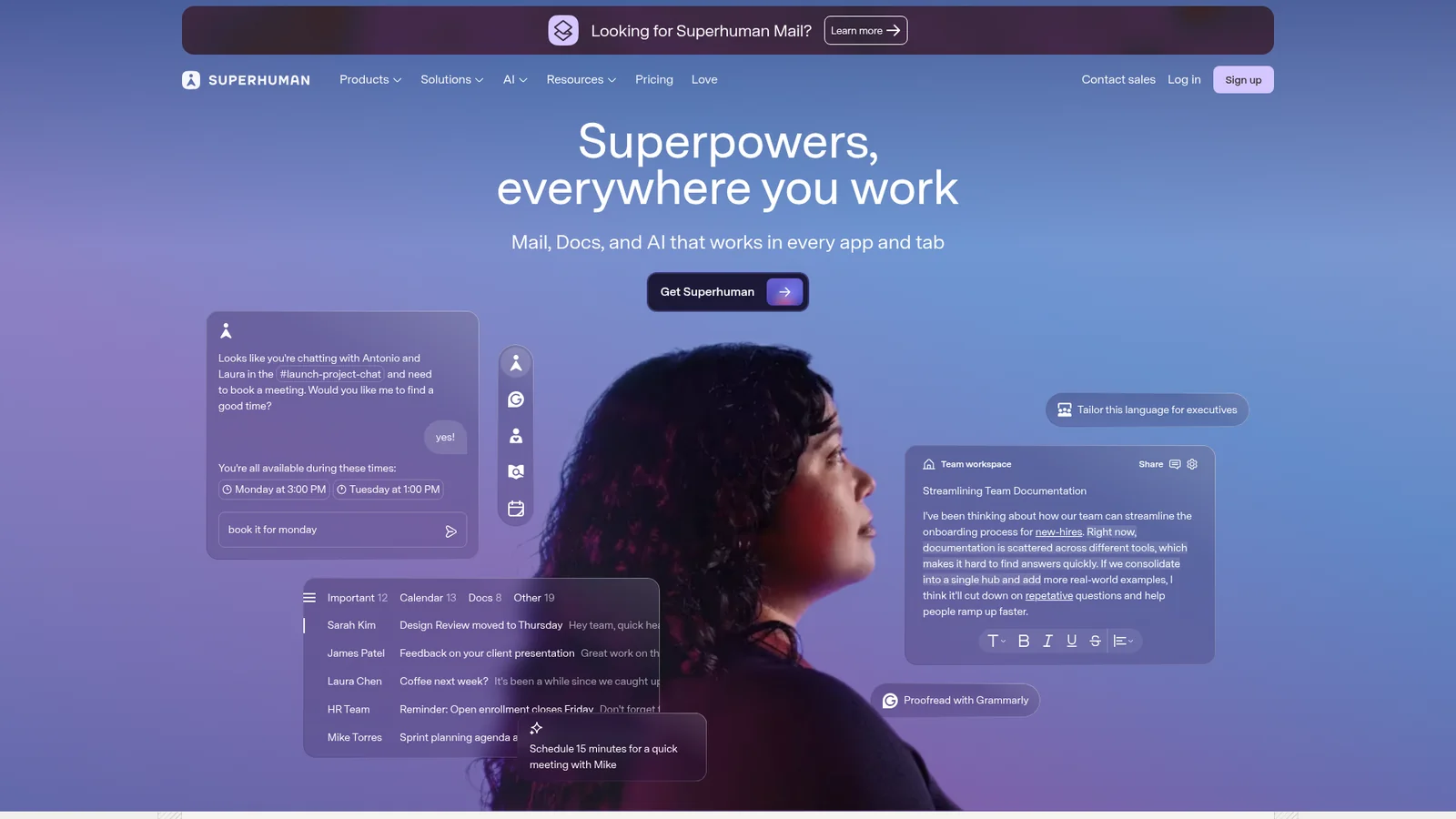
生产力与 SaaSAn inspired interpretation of Superhumon's design language — a fast-email productivity brand split between an editorial dark hero (deep indigo navy with violet-sky atmospheric backdrop and a portrait subject) and a quiet white content body with off-warm-grey ink. The system uses a single proprietary variable display sans, heavy weight 460–540 with tight tracking, and a deep-teal closing CTA band that breaks the indigo/white rhythm with a warm dark interlude. Buttons are tight rounded rectangles, pricing is sober and dense, and the brand reads more like a high-end newsletter than a SaaS app.
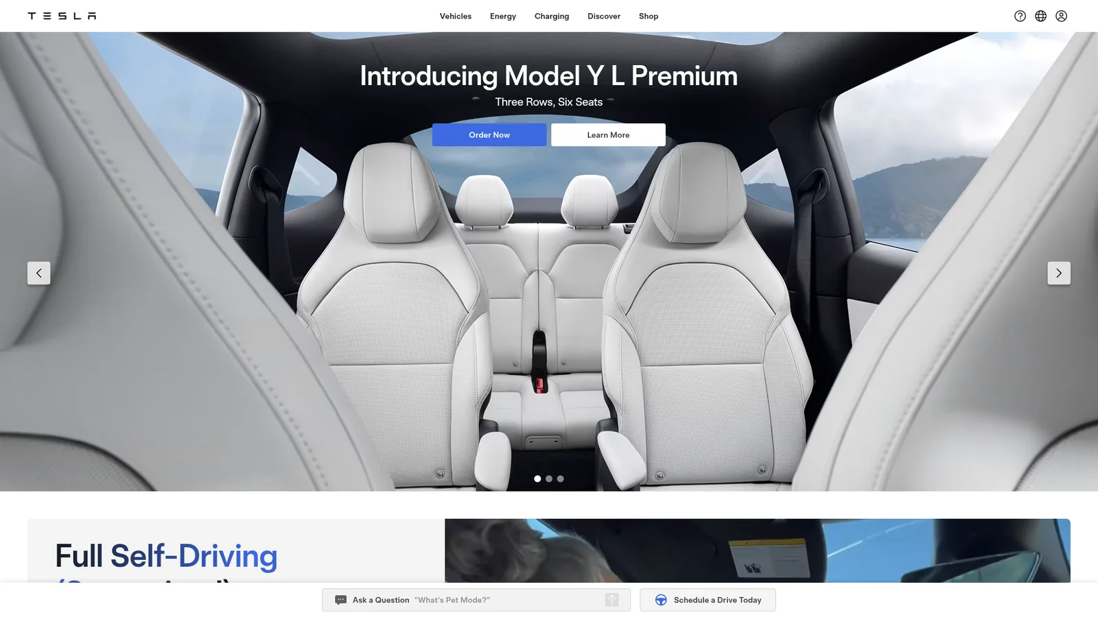

Tesla
汽车Tesla's website is an exercise in radical subtraction — a digital showroom where the product is everything and the interface is almost nothing. The page opens with a full-viewport hero that fills the entire screen with cinematic car photography: three vehicles arranged on polished concrete against a hazy cityscape sky, with a single model name floating above in translucent white type. There are no decorative borders, no gradients, no patterns, no shadows. The UI exists only to provide just enough navigational structure to get out of the way. Every pixel that isn't product imagery is white space, and that restraint is the design system's most powerful statement.
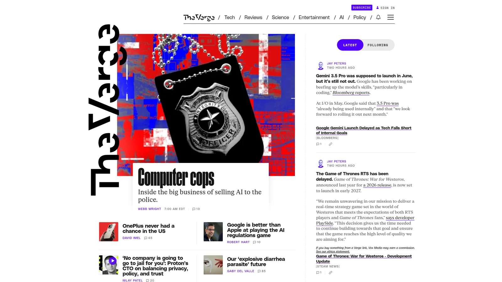
The Verge
媒体与消费科技The Verge's 2024 redesign feels like somebody wired a Condé Nast magazine to a chiptune soundboard. The canvas is almost-black (`#131313`), the headlines are built from a brutally heavy display face (Manuka) that runs up to 107px, and the whole page is peppered with acid-mint `#3cffd0` and ultraviolet `#5200ff` that behave less like brand colors and more like hazard tape. Story tiles are not quiet gray cards — they're saturated, full-bleed color blocks (yellow, pink, orange, blue, purple) that feel like pasted-up rave flyers arranged into a timeline. The mood is "developer console meets club night meets tech tabloid": serious enough to cover a congressional hearing, loud enough to review a synthesizer.
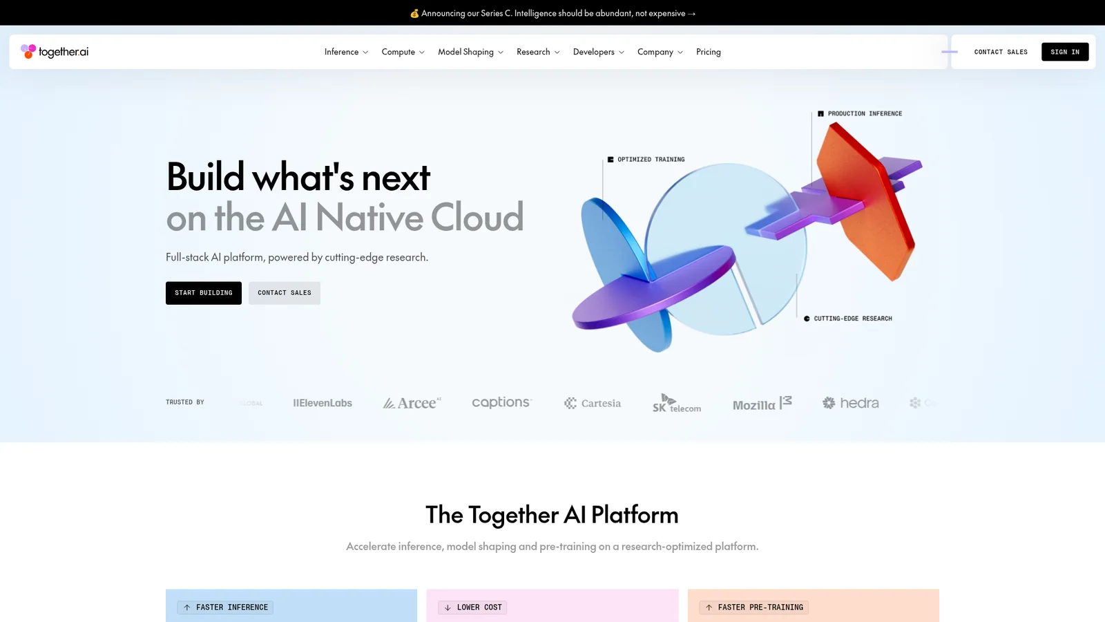

Together-AI-Inspired
AI 与大模型平台An inspired interpretation of Together AI's design language — an AI infrastructure platform whose surface alternates between near-black hero bands (with a three-color orange-magenta-periwinkle gradient as the single piece of brand chrome) and bright white research / pricing / docs bands, knit together by a custom display sans and an uppercase mono eyebrow face.
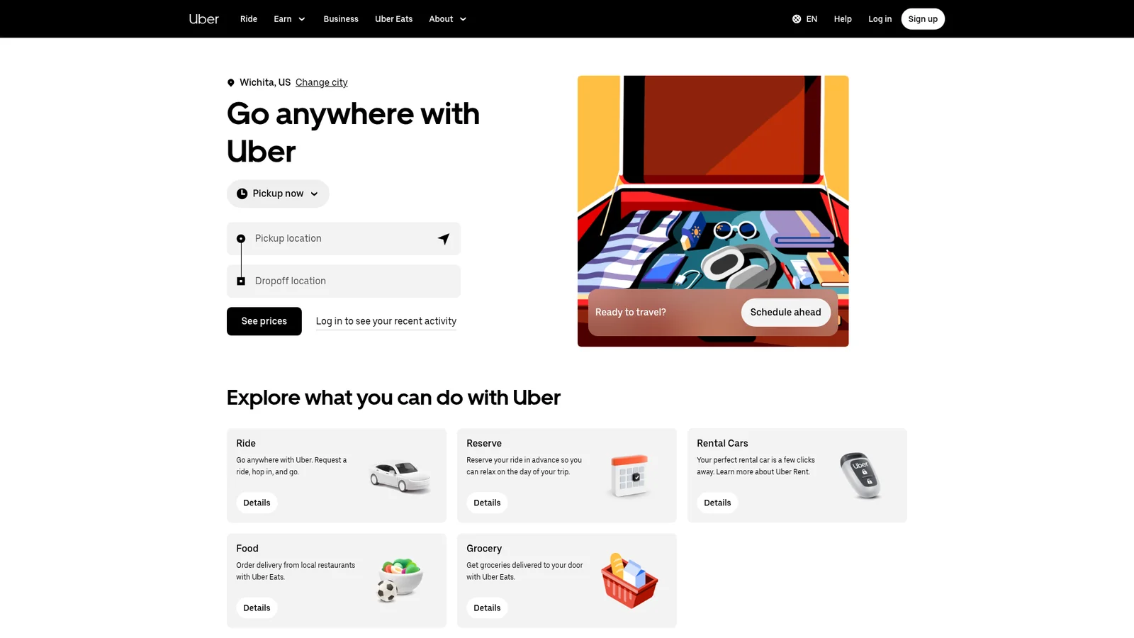

Uber-Inspired
旅行与出行An inspired interpretation of Uber's design language — a transportation-and-delivery super-app brand whose web surface is a black-and-white duet, framed by a custom geometric display sans, accented by a single signature pill shape (radius 999px) on every interactive element, and decorated only by editorial 4:3 illustrations of riders, drivers, and city objects.
Vercel
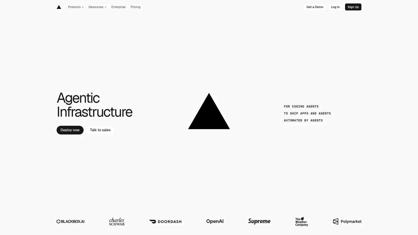
开发者工具与 IDEAn inspired interpretation of Vercel's design language — a developer-platform brand whose surface is a stark black-and-ink duet on near-white canvas, broken at hero scale by a multi-color mesh gradient (cyan / blue / magenta / amber) that acts as the entire decorative system, paired with a custom geometric sans for headlines and a monospaced caption face for technical labels.
Vercel Dark
开发者工具与 IDEA dark interpretation of Vercel's Geist interface language: a true-black developer canvas, compact white typography, charcoal surface steps, and a single blue interaction signal. Hierarchy comes from border contrast rather than decorative effects.

Vodafone-Inspired
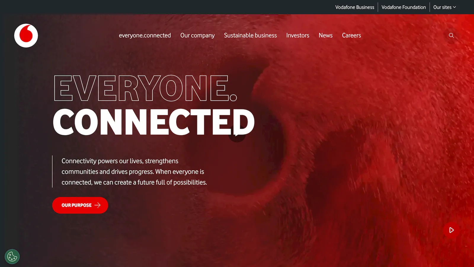
企业级技术An inspired interpretation of Vodafone's design language — a telecom super-brand whose web surface alternates between editorial photography hero bands with massive uppercase display headlines and clean white content bands, anchored by the company's signature scarlet red CTA and the proprietary Vodafone display sans set at impossibly heavy 800 weight.
Voltagent-Inspired
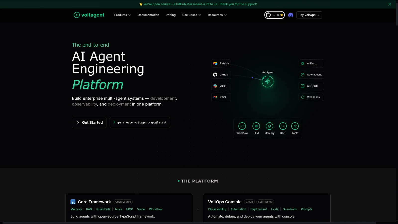
开发者工具与 IDEAn inspired interpretation of Voltagent's design language — a developer-focused AI agent engineering platform whose surface is an unrelenting near-black canvas broken only by a single electric-green brand accent, code-editor mockups inside the hero, and a precise grid of dark feature cards that read like a documentation site dressed as marketing.

Warp-Inspired
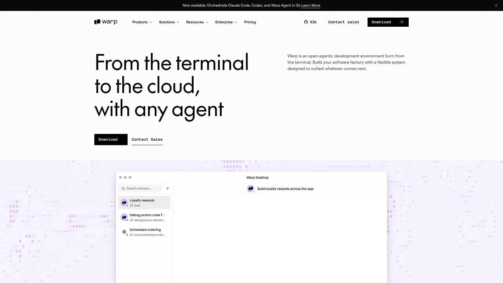
开发者工具与 IDEAn inspired interpretation of Warp's design language — an agentic terminal-and-development-environment brand whose surface is a warm near-charcoal canvas (a tint warmer than pure black), broken only by clean Inter typography, the occasional Instrument Serif italic moment, and dense terminal-mockup imagery; CTAs are unusually understated, with shape geometry running tighter than most marketing sites.
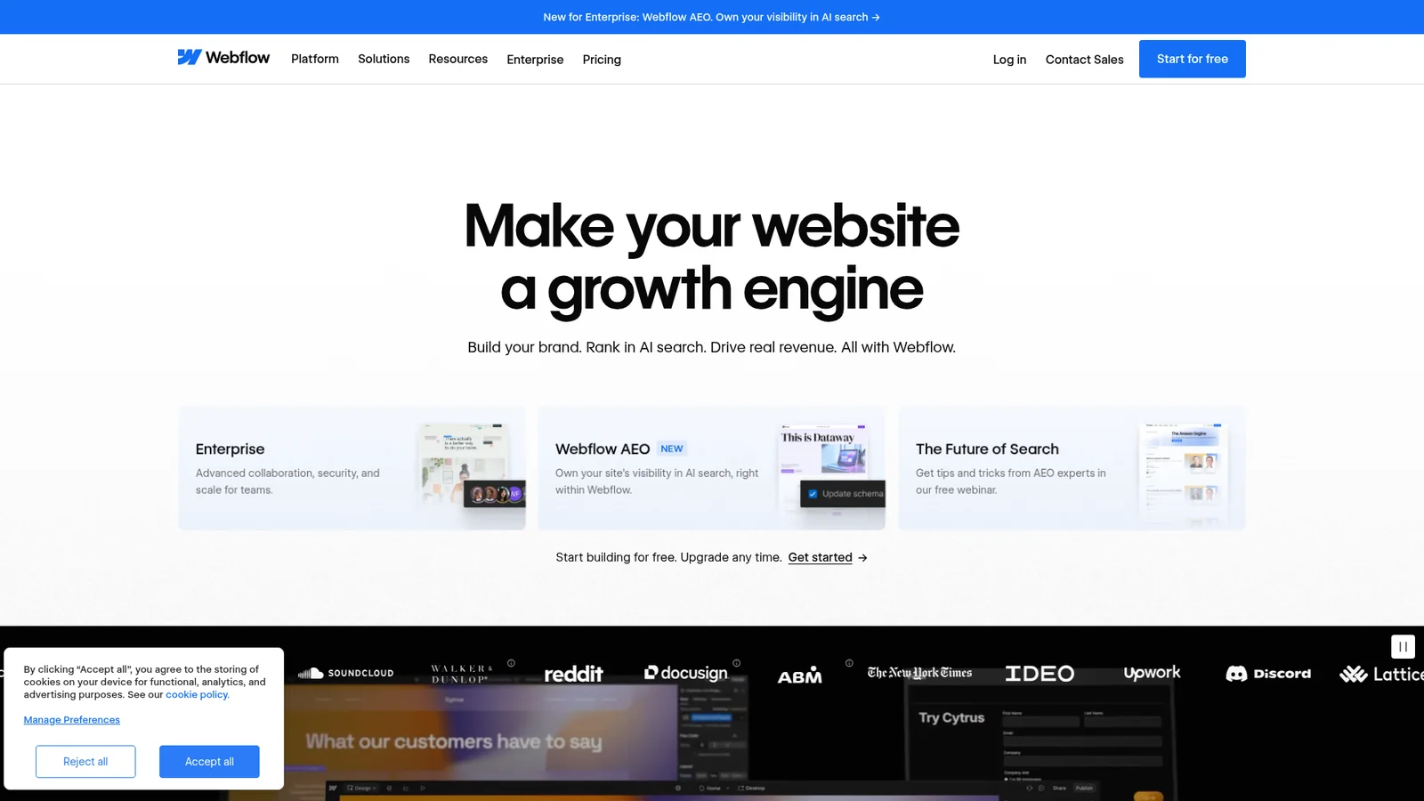

Webflow-Inspired
设计与创意工具An inspired interpretation of Webflow's design language — a visual web development platform whose surface contrasts a deep near-black `#080808` primary against a generous white canvas, broken by a five-stop chromatic accent system (purple / pink / blue / orange / green) that maps to the brand's product categories, and anchored by the proprietary WF Visual Sans family used at restrained 500 / 600 weights with negative tracking.
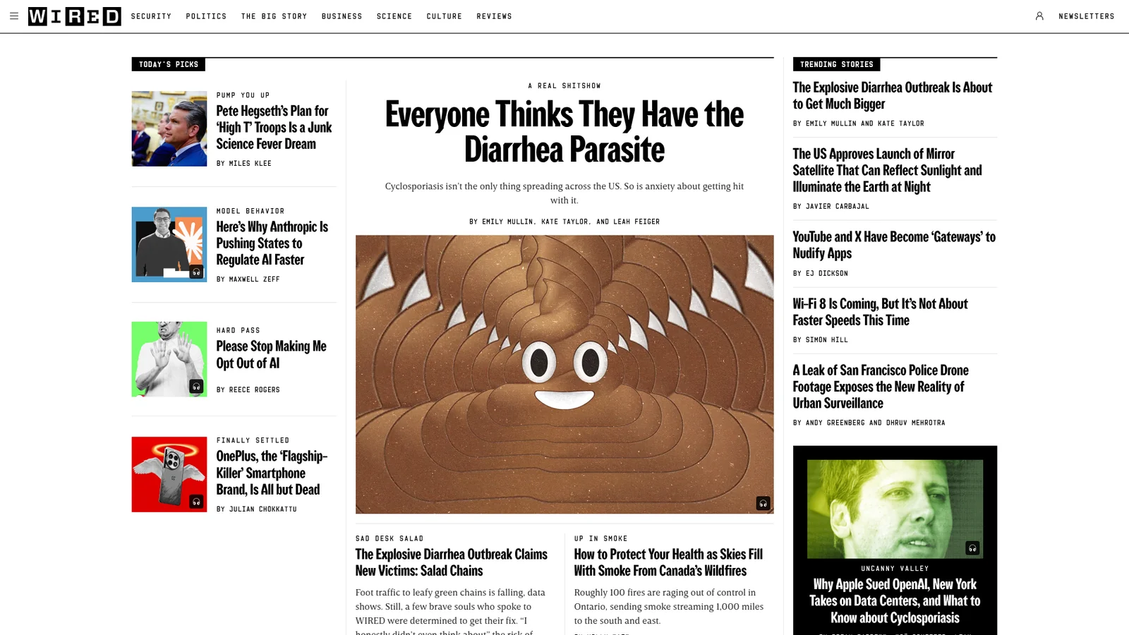
Wired-Inspired
媒体与消费科技An inspired interpretation of Wired's design language — a flagship technology-magazine brand whose surface is a strict editorial duet of stark black wordmark on white canvas, anchored by a tall narrow custom display serif for hero headlines, a humanist serif body face for long-form reading, and a clean sans face for metadata; layout reads like a printed magazine ported to the web with very little marketing chrome.
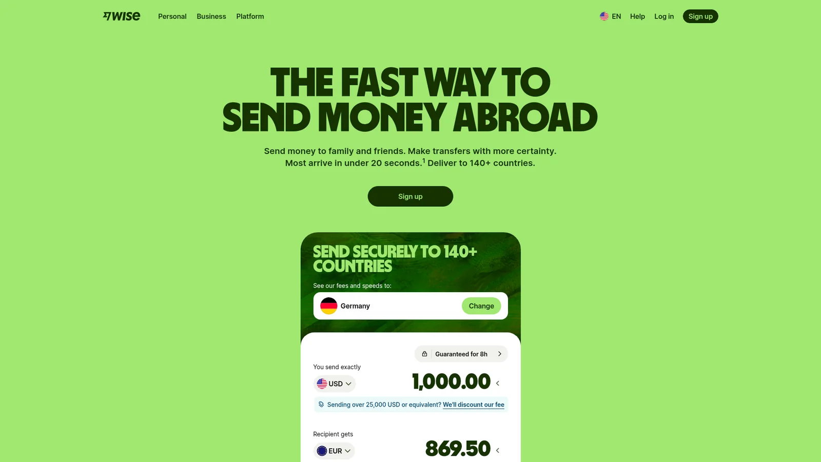

Wise-Inspired
金融科技与加密An inspired interpretation of Wise's design language — a global money-transfer brand whose surface combines an unusually heavy near-black display sans (weight 900 at 64–126 px) with a vivid lime-green brand accent, sage-tinted surface neutrals, and rounded white cards on a pale green-tinted canvas; the whole system reads more like a Scandinavian fintech magazine than a bank.
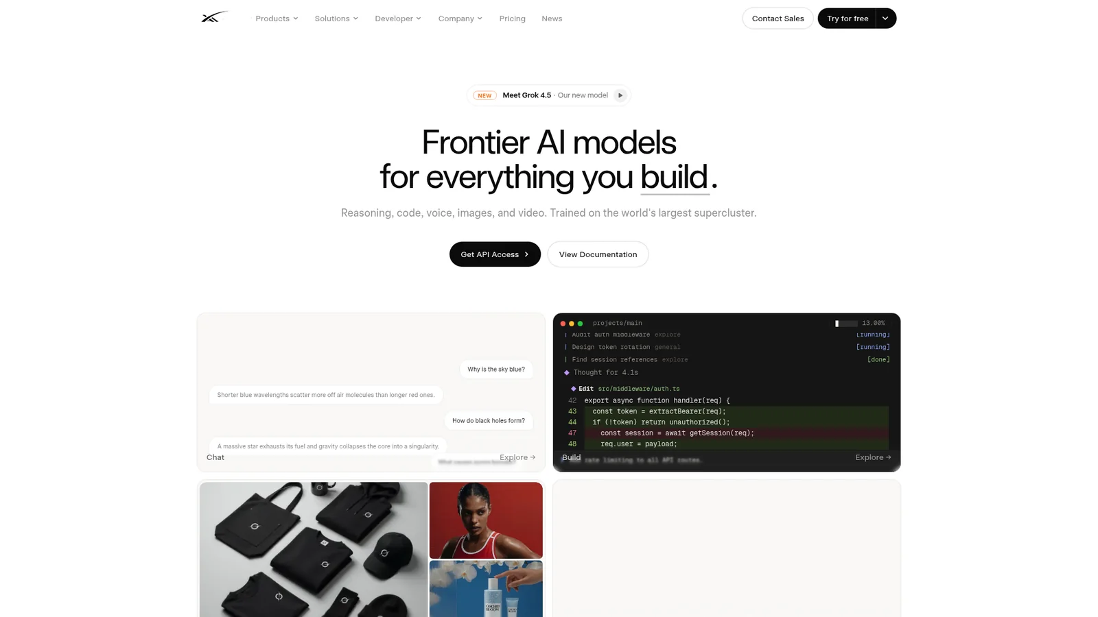
SpaceXAI
AI 与大模型平台A verified light interpretation of SpaceXAI's current web identity: white canvas, near-black typography, generous editorial spacing, monochrome pill actions, and border-led technical panels set in Universal Sans and Geist Mono.
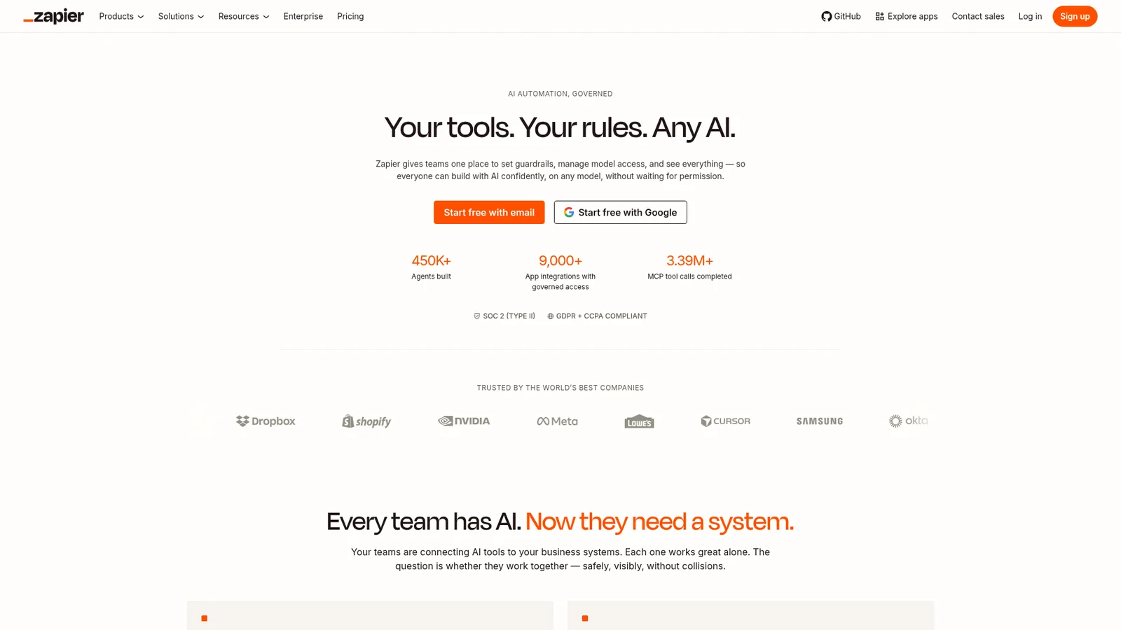
Zapier-Inspired
生产力与 SaaSAn inspired interpretation of Zapier's design language — a workflow-automation platform whose surface combines warm-cream neutrals (`#fffefb` canvas, `#f8f4f0` soft cream) with deep coffee ink (`#201515`) and a single saturated orange CTA accent (`#ff4f00`); typography pairs the proprietary Degular Display family at hero scale with Inter for sub-displays and body, giving the brand a confident-warm rather than cool-tech voice.
没有符合条件的设计风格。